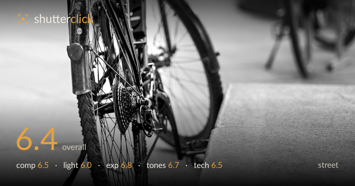
A bicycle parked on the pavement
Photo by mariya_m

No EXIF metadata in this file
Technical analysis based on visual assessment only.
A clean, quiet study of a parked bicycle that reads more as a detail shot than a street moment. The strongest element is the layering — the sharp foreground bike, a second bicycle mid-frame, and the soft pedestrians beyond build genuine depth. What holds it back is the absence of a decisive moment or human gesture; this is a static object, so it leans on formal qualities alone. The kickstand and near tyre sit uncomfortably close to the bottom edge, and the bright, flat background pulls attention toward empty highlights. A stronger point of focus or a passing figure would give it more narrative weight.
The diagonal recession of the pavement and the receding second bicycle create solid depth, and placing the main bike on the left third works. The blurred pedestrian and distant frames add scene layers. However, the front wheel and kickstand are cramped against the bottom edge, and the concrete ledge cutting in from the lower right feels like dead weight that flattens the right side. The upward-angled framing gives an interesting worm's-eye feel but leaves a lot of unresolved bright background dominating the upper half.
The light is soft and overcast-flat, which suits the muted mood but gives the chrome and metalwork little to shape it — the frame, spokes and hubs lack the specular pop that would make the mechanical detail sing. There's no clear directionality, so the bicycle reads slightly two-dimensional despite the shallow depth. A raking side light, or shooting nearer golden hour, would carve out the tubing and tyre tread with far more dimension and separate the subject from the pale ground.
Exposure is handled reasonably for a high-key scene. The background highlights on the far pavement and shopfronts push near clipping but mostly retain a sliver of tone, and the darker bicycle frame holds shadow detail without blocking up. The overall bias toward brightness fits the airy street feel. The main risk is that the blown upper background draws the eye away from the subject; pulling exposure down a touch, or metering for the metalwork, would keep more information in those washed-out zones and anchor attention forward.
The black-and-white conversion is competent, with a full range from the deep tyre blacks to bright pavement highlights. Mid-tone gradation on the concrete is smooth. That said, the image sits slightly soft in contrast — the whites feel milky rather than clean, and the blacks could go deeper to add snap to the frame and spokes. A firmer contrast curve, or a subtle deepening of the darkest tones, would give the metalwork more presence against the pale ground without losing the gentle mood.
Focus lands accurately on the rear wheel, cassette and lower frame, which is the natural resolving plane, and the shallow depth of field cleanly separates the subject from the busy street behind. The bokeh is smooth and pleasant, rendering the second bicycle and pedestrians as soft supporting shapes. The trade-off is that the handlebars and front of the bike fall outside the sharp zone, so the eye never gets a fully resolved read of the whole machine — a slightly smaller aperture would have carried focus across more of the frame while keeping the background soft. Noise is well controlled and there's no visible motion blur, so the shutter and ISO choices appear sound for the conditions. The near tyre tread shows good micro-detail, evidence of a capable lens and steady handling. Overall execution is clean; the main technical decision worth revisiting is depth-of-field placement to keep the primary subject cohesively sharp.
What would elevate it
Tags
Shot something like this?
Expert photo critique, on demand — scored across six categories, EXIF-aware. Start with 3 free critiques, no credit card.
critique my photo — free