A figure in the light beam
Photo by mostafa_meraji

No EXIF metadata in this file
Technical analysis based on visual assessment only.
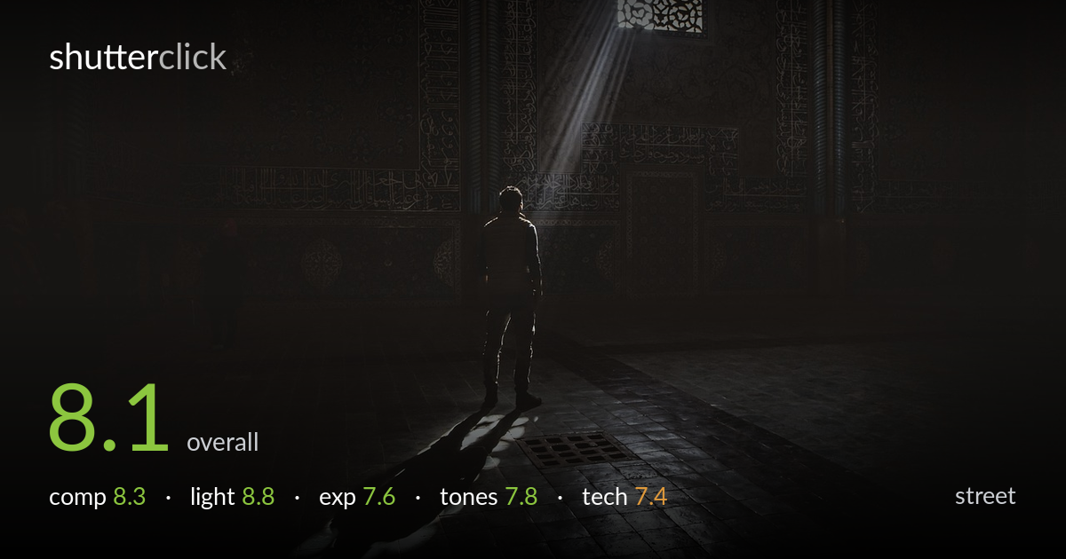
A single shaft of window light carrying a lone figure across a darkened mosque interior — this is the kind of decisive light-and-moment alignment that elevates an atmospheric frame into a story. The figure stands at the edge of the beam, head tilted toward the ornate window, casting a long diagonal shadow that anchors the lower frame. What most holds it back is a slightly soft, distant subject and a vast expanse of near-black wall that, while moody, risks reading as empty rather than intentional. The beam itself does most of the storytelling work, and it does it beautifully.
The figure sits left of centre with the light beam descending from the upper right, and the long shadow stretching to the lower-left corner builds a strong diagonal that ties the frame together. The ornate window in the upper right gives the eye a destination and explains the light source. The expanse of shadow on the left is heavy — a touch of detail or a second figure there would balance the weight. The floor's tile lines provide subtle leading lines toward the subject, which works in this dim setting.
This is the frame's greatest strength. A single hard shaft through the latticed window cuts through the gloom and lands precisely where the figure stands, rim-lighting the shoulders and throwing a long, expressive shadow. The visible volumetric beam — likely dust or haze in the air — gives the light physical presence. The contrast between the brilliantly lit pool of floor and the surrounding darkness is dramatic and well controlled. Timing this so the figure aligned with the beam is the decisive moment that makes the shot.
The exposure is biased dark to preserve the beam's drama, and that choice mostly pays off — the highlights in the lit floor and window hold detail without blowing out, and the figure reads as a near-silhouette by design. The risk is the sheer volume of shadow: large areas of the wall fall to near-black, sacrificing the ornate tilework that gives the space context. A modest shadow lift in the wall areas would recover some of that detail without flattening the mood.
The near-monochrome, cool-toned palette suits the contemplative, sacred atmosphere, with faint warmth in the lit floor pool providing quiet contrast. The tonal range is dominated by deep shadows with a narrow band of bright highlight in the beam — deliberate and effective for the mood. The midtones in the wall ornamentation are crushed, so much of the architectural texture is lost. A gentler shadow roll-off would let more of the calligraphy and tilework emerge while keeping the overall darkness intact.
Working in this little light is demanding, and the frame holds up reasonably. The figure is rendered soft rather than crisply sharp — partly the dim conditions, partly distance from the camera, and the lack of fine edge detail keeps the subject from snapping into focus the way the lit floor tiles do. Noise is well managed in the shadow areas given the low light, with no obvious smearing, suggesting a sensible ISO and exposure balance. The wide framing captures the architecture but leaves the human subject small in the frame. A slightly longer focal length or a step closer would have given the figure more presence while keeping the beam intact. Depth of field appears sufficient to keep both figure and floor acceptably sharp. The main improvement would be nailing focus precisely on the figure, since that is the emotional anchor the eye seeks even though the light is the hero.
what would elevate it
tags
Shot something like this?
Expert photo critique, on demand — scored across six categories, EXIF-aware. Start with 3 free critiques, no credit card.
critique my photo — free