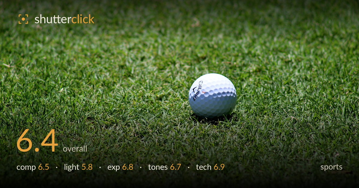
A golf ball on the green
Photo by Pexels

No EXIF metadata in this file
Technical analysis based on visual assessment only.
A clean, well-isolated golf ball sits above centre against a shallow bed of grass, and the dimple texture and Callaway branding read crisply where focus lands. The shallow depth of field does the heavy lifting, separating the subject from a soft green field. What holds it back most is the flat, high overhead midday light, which gives the ball a slightly washed, contrast-poor rendering and offers no shaping shadow beneath it. As a static object rather than a moment of play, it reads more as product detail than sports action, so the frame lacks narrative tension or a sense of the game unfolding.
The ball placed right of centre and slightly high uses the frame reasonably, leaving room for the grass to breathe below and to the left. The soft foreground and background gradients create depth, drawing the eye to the sharp subject. However, the placement flirts with dead-centre horizontally and the surrounding negative space is uniform, offering little to lead the eye or suggest context. A stronger diagonal in the grass texture, or lowering the angle to catch a horizon or course element, would give the composition more purpose beyond isolation.
The light is flat, hard midday sun from high above, which flattens the ball's spherical form and leaves it looking slightly chalky rather than dimensional. There is no meaningful shadow anchoring the ball to the grass, so it seems to float. The dimple texture catches some modelling, but a raking side light near golden hour would carve those dimples and cast a grounding shadow. As shot, the lighting is serviceable but does nothing to elevate the subject.
Exposure is competently handled. The white ball retains dimple detail without blown highlights, which is the main risk with a bright subject under strong sun, and the grass holds shadow information in its deeper blades. Midtones sit comfortably and the histogram appears well distributed. The overall rendering leans a touch bright, contributing to the washed feel on the ball, but nothing clips destructively. A slight pull on the highlights would restore a bit more sculpting on the ball's lit side.
The greens are natural and pleasant, with decent separation between sunlit and shaded blades giving the grass some tonal variety. White balance reads accurate, neither too cool nor too warm. Contrast is moderate but a little soft overall, contributing to the flat impression. The ball's white sits slightly grey-blue in the shaded lower half, which is honest but undramatic. A modest contrast and clarity boost would make both the grass texture and the ball's dimples pop with more life.
The shallow depth of field is the strongest technical choice here, throwing foreground and background into smooth blur while keeping the front face of the ball and the branding sharp. Focus appears accurate on the near hemisphere, though the plane is thin enough that the rear of the ball softens slightly, an inevitable trade at this aperture and proximity. Detail rendering on the dimples and text is clean with no visible noise, suggesting a low ISO and good light. Lens choice suits the isolation goal well. The main technical limitation is not execution but conception for the stated genre: as a sports frame this reads as a still-life detail with no motion, no action, no shutter-speed challenge to solve. If the aim were true sports coverage, freezing a putt or a ball mid-roll would test technique far more. As a static study, the craft is solid and the focus discipline is commendable.
What would elevate it
Tags
Shot something like this?
Expert photo critique, on demand — scored across six categories, EXIF-aware. Start with 3 free critiques, no credit card.
critique my photo — free