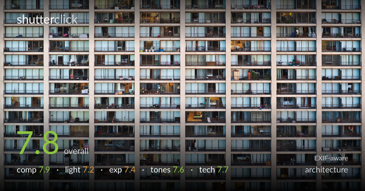
A grid of apartment windows at dusk
Photo by Dllu

| Focal length | 0 mm |
| Aperture | f / 0.0 |
| Shutter | 5/8 s |
| ISO | ISO 100 |
| Exp. comp. | 0.0 EV |
| Shot at | 21:00 · Nov 20, 2016 |
A relentless grid of apartment facades turns repetition into the subject, and the strength here is the typological, frame-filling approach that rewards close reading — every balcony a different small life. The flat, frontal framing is exactly right for the concept. What most holds it back is the slightly uneven framing at the edges: the partial columns left and right and the cropped rows top and bottom read as arbitrary rather than deliberate. Verticals are largely clean, which the rigid geometry demands. Tightening the edge alignment and committing fully to the symmetry would lift this from a strong study to a definitive one.
The frame-filling, edge-to-edge grid is the whole point and it works — the absence of sky or ground forces the eye into the pattern and the individual windows. The repetition builds rhythm while each lit interior breaks it just enough to hold attention. The weakness is at the margins: the left and right columns are cut mid-balcony unevenly, and the top and bottom rows are clipped without a clear logic. A more deliberate decision about where the grid begins and ends would make the crop feel intentional rather than simply stopped.
Shooting at dusk is the smart call — the balance between the cool blue ambient light on the curtains and the warm tungsten glow from occupied units gives the facade variety it would lack in flat daylight. The soft, shadowless illumination suits the flat frontal treatment and keeps the geometry clean. The trade-off is that the overall light is fairly even and low-contrast, so the facade reads slightly muted. Catching the moment when more interiors glow against a darker exterior would amplify the patchwork effect considerably.
Exposure is well controlled for a scene with mixed interior and exterior light levels. The bright curtained panels hold their texture without blowing out, and the darker recesses and balcony railings retain detail. Nothing important clips at either end, which matters in a flat field where any pure-white or crushed-black cell would stand out as an error. The midtones sit a touch flat across the whole frame, leaving the image feeling slightly low in punch, but that is a tone decision more than an exposure fault.
The cool-versus-warm contrast between blue daylight curtains and amber interior lights is the tonal engine of the image and it is handled with restraint. White balance reads neutral on the concrete, letting the warm windows pop as accents. The concrete itself carries a pleasant range of beige and grey gradations. Overall saturation is modest, which suits the subject, though the whole frame leans slightly toward a uniform muted register. A touch more separation between the cool field and warm pockets would sharpen the patchwork reading.
The 5/8-second shutter at ISO 100 on the A7R indicates tripod work, which is essential for this much detail across a flat plane — and the execution holds up. Sharpness is consistent corner to corner, with individual balcony objects, railings and curtain folds resolving cleanly, exactly what a typological facade study demands. The high-resolution sensor is well suited to a subject that rewards pixel-level inspection. The slow shutter is fine since the facade is static, and base ISO keeps noise negligible. Lens and aperture data didn't record, but the depth of field is effectively flat-field here, so the focus plane covers the whole subject without issue. The only execution concern is whether the camera was perfectly parallel to the building: verticals are close but a hair of convergence or tilt may remain, which matters more in a strict grid than in most architecture. A careful check of plane alignment, ideally with a tilt-shift lens or in-camera level, would lock the geometry completely.
what would elevate it
tags
Shot something like this?
Expert photo critique, on demand — scored across six categories, EXIF-aware. Start with 3 free critiques, no credit card.
critique my photo — free