A knowing look over coffee
Photo by Martin Sojka

No EXIF metadata in this file
Technical analysis based on visual assessment only.
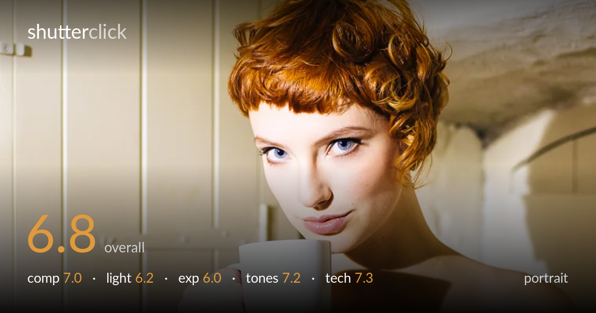
A confident portrait with a strong gaze and a clear narrative hook in the raised mug, but harsh directional light is the main thing holding it back. The hard shadow cast by the mug across the chest is distracting and reads as a compositional accident rather than intent. The eyes are sharp and the warm palette suits the redhead-and-cream styling. The cluttered cupboard and ironwork on the left compete for attention, and the bright window glare upper right pulls the eye out of frame. Softening the key light and cleaning the background would lift this considerably.
The subject sits slightly left of centre with the mug creating a natural triangle from hand to face, which works. The slight tilt and over-the-mug gaze give a knowing, candid energy. However, the background is busy: the cupboard handle, hinge and ironwork on the left all draw the eye, and the blown-out window edge upper right leaks attention out of frame. The bottom crop through the corset is awkward, neither full-length nor a clean three-quarter stop. A cleaner backdrop and a more deliberate lower crop would focus everything on the face.
Hard, high directional light is the weakest element. It carves a strong, unflattering shadow from the mug straight across the chest and collarbone, which reads as accidental rather than shaped. The same hardness exaggerates skin shine on the shoulder and blows the wall upper right. There are nice catchlights and the warm spill flatters the hair, but the contrast is too steep for a portrait. A diffused source, or a fill card to lift the shadow side, would render the skin and form far more gently.
Skin midtones land reasonably, but the highlights are pushed hard. The window edge upper right and patches of wall are clipped, and the lit shoulder is close to losing detail. Meanwhile the shadowed neck and the cast mug-shadow fall fairly deep. The dynamic range of the scene exceeds what the single hard source allows to be held cleanly, so the histogram is stretched at both ends. Pulling exposure down a touch and recovering the highlights, or flagging the brightest wall area, would protect the tonal extremes.
The warm, creamy palette is the strongest aspect — the cream corset, pale cupboard and copper hair sit together harmoniously, and white balance leans warm in a way that suits the mood. Skin tones are believable without over-saturation, and the blue eyes provide a welcome accent against the warmth. Contrast is on the high side, partly from the hard light, which crushes some shadow gradation in the neck. A slightly cooler shadow tone would add separation, but overall the grading is coherent and pleasing.
Focus is accurately placed on the eyes, which are crisp and carry the necessary catchlights, and the hair detail holds well. Depth of field appears moderately shallow, enough to soften the cupboard slats without fully dissolving the distracting hardware, so a wider aperture or more subject-to-background distance would have cleaned the backdrop further. The mug and hand are rendered sharply, and there is no visible motion blur, suggesting an adequate shutter speed for a static pose. Noise is well controlled, indicating a sensible ISO. The lens choice gives a natural facial perspective without distortion, appropriate for portraiture. The main technical limitation is not the capture sharpness but the lighting control: the hard key produces specular highlights on the shoulder and a hard-edged shadow that no aperture choice can fix. Managing the light source and increasing background separation would do more for this frame than any change to focus or exposure settings.
what would elevate it
tags
Shot something like this?
Expert photo critique, on demand — scored across six categories, EXIF-aware. Start with 3 free critiques, no credit card.
critique my photo — free