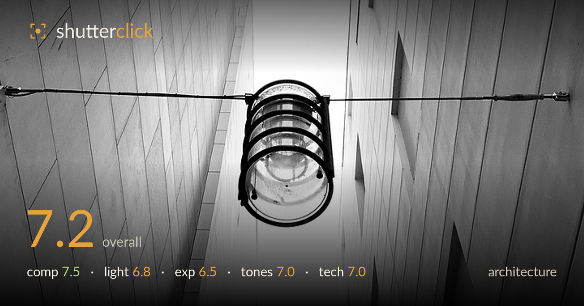
A lamp between converging walls
Photo by DAVID_UNDERLAND

No EXIF metadata in this file
Technical analysis based on visual assessment only.
A strong graphic idea: a caged lamp suspended on a wire, framed by two converging walls that funnel the eye up toward a bright sliver of sky. The upward look-up perspective and the near-symmetry of the two facades give the frame real tension and depth. What most holds it back is the near-total blowout of the central sky, which erases the strongest tonal anchor behind the subject and leaves the lamp floating in white. The lamp itself, the natural focal point, also sits slightly high and small in the frame. Tighter exposure control on the highlights and a hair more presence for the subject would elevate a genuinely arresting composition.
The wedge of two facades converging toward the sky is a confident, dynamic structure, and the horizontal wire cutting across the vertical thrust adds welcome counterpoint. The lamp anchored dead-centre on that wire is a satisfying focal point. The near-symmetry between the two walls works for this brutalist geometry. That said, the lamp sits fairly small against the vast walls, and the tiled repetition on both sides, while rhythmic, competes for attention. Slightly more scale for the lamp would sharpen the hierarchy.
Flat, diffuse overcast light suits the concrete's texture and keeps the tile grid legible on both walls, but it offers little modelling. The sky between the buildings is the brightest source and it simply overwhelms the frame rather than shaping the subject. The lamp receives no directional light to give it dimension, so it reads as a silhouette against blown white. A moment with softer, lower sky brightness, or shooting when the gap held graduated tone, would give the scene more depth and separation.
The central sky is clipped to pure white with no recoverable detail, and that loss is the weakest technical point here, flattening the depth cue that the receding walls set up. The concrete walls hold detail well and the shadows retain gradation, so the mid-to-low range is handled competently. The exposure appears driven by protecting wall detail at the sky's expense. Bracketing or metering for the highlights would have preserved a tonal ceiling behind the lamp and reinforced the sense of looking upward.
The black-and-white conversion suits the subject, with a clean spread from the near-black lamp cage to the white sky. Mid-tone gradation across the concrete tiles is smooth and describes the surface convincingly. Contrast is a touch high overall, which contributes to the highlight clipping but also gives the lamp welcome graphic punch. Highlight roll-off into the sky is abrupt rather than gradual. A slightly gentler tone curve at the top end would soften that transition and give the whites more nuance.
Focus is placed accurately on the lamp, which is the correct decision, and the cage detail and glass reflections read clearly. Depth of field is deep enough to hold both walls acceptably sharp, appropriate for architecture where corner-to-corner clarity matters. The tiled surfaces show fine texture without obvious noise, suggesting a low sensitivity and adequate light. The upward framing has kept the two facades reasonably parallel, avoiding severe keystoning, though the extreme vertical perspective naturally exaggerates convergence toward the top. Handling appears steady with no motion blur, and the wire and its clamps are rendered crisply against the sky. The main technical shortfall is exposure management of the bright gap rather than any focus or sharpness fault. A polarizer or a graduated approach would have tamed the sky glare, and a fractionally wider or lower vantage could have brought the lamp larger in the frame without sacrificing the converging geometry.
What would elevate it
Tags
Shot something like this?
Expert photo critique, on demand — scored across six categories, EXIF-aware. Start with 3 free critiques, no credit card.
critique my photo — free