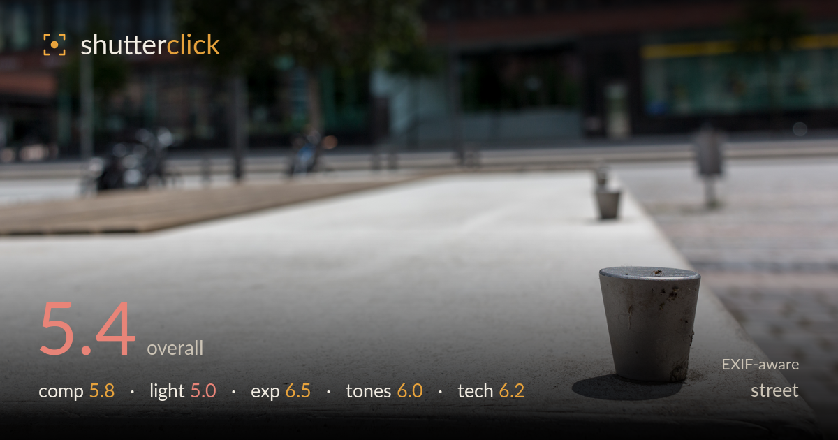
A lone cap on the ledge
Photo by Dietmar Rabich

| Focal length | 24 mm |
| Aperture | f / 5.6 |
| Shutter | 1/1000 s |
| ISO | ISO 100 |
| Exp. comp. | 0.0 EV |
| Shot at | 13:34 · Jun 11, 2016 |
A small metal cap on a concrete ledge is elevated into an unlikely protagonist through selective focus and a low, close viewpoint. The idea has wit — the mundane object staged against an empty urban plaza. What holds it back is that the metaphor stays thin: the background is soft to the point of anonymity, so the city context that would give the object meaning barely reads. Midday sun flattens the scene and pins the shadows harshly. The concept is sound; the execution needs a stronger relationship between the tiny subject and the world behind it to earn the isolation.
The bottom-right placement of the cap works, giving the sweeping concrete ledge room to lead the eye toward it, and the diagonal of the ledge is a genuine asset. But the foreground concrete claims nearly half the frame with little texture reward, so the balance tips toward emptiness rather than tension. The tree and buildings sit as a soft backdrop that neither supports nor competes with the subject. A slightly lower angle or tighter framing would tighten the dialogue between the small object and its setting.
Hard midday sun is the main limitation. It renders the concrete as a bright, near-featureless slab and drops a stubby, unflattering shadow beside the cap. There is no modelling to reveal the object's form or the surface texture that could have made the concrete interesting. The flat overhead angle also drains the buildings and tree of dimension in the background. Raking side light from a lower sun would carve texture into the ledge and give the little subject a longer, more expressive shadow.
Exposure is handled cleanly for the harsh conditions. The bright concrete holds detail without blowing out, and the metal cap retains its tonal range including the dark grime on its surface. Shadow areas in the background windows stay readable. The histogram sits comfortably in the upper-mid range, appropriate for a sunlit scene. If anything, a touch more shadow presence in the foreground would add depth, but nothing is clipped in a way that damages the image. Solid, deliberate metering.
The palette is muted and cohesive — cool concrete greys against the desaturated greens and reds of the distant facade. White balance reads neutral, perhaps a hair cool, which suits the sterile urban mood. Contrast is moderate; the midday light forces some harshness in the transitions but the overall tonal separation between subject and surface is adequate. The greens of the tree feel slightly flat, a byproduct of the overhead light rather than the grade. A modest contrast lift on the cap would help it separate.
At f/5.6 on a 24mm lens, the depth of field is shallower than the aperture alone suggests because of the extreme close focusing distance — the cap is sharp while everything a few metres back dissolves. Focus lands accurately on the subject, and 1/1000s at ISO 100 is well within margins for a static scene, leaving no noise and no motion issues. The choice is sound but arguably overcommitted: the background is so soft that the city loses all legibility, weakening the juxtaposition the shot depends on. Stopping down to f/8 or f/11, or stepping back slightly, would keep the cap sharp while letting the tree and buildings register as recognisable context rather than colour blobs. The 24mm is a reasonable focal length for including environment, but the framing does not fully exploit its width. Overall the execution is clean and competent; the settings simply serve isolation more aggressively than the concept benefits from.
What would elevate it
Tags
Shot something like this?
Expert photo critique, on demand — scored across six categories, EXIF-aware. Start with 3 free critiques, no credit card.
critique my photo — free