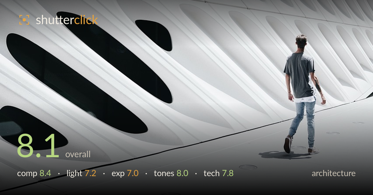
A lone figure against the facade
Photo by ranerd

No EXIF metadata in this file
Technical analysis based on visual assessment only.
A strong sense of scale carries this frame — the lone figure against the sweeping honeycomb facade turns architecture into a study of human proportion against monumental form. The diagonal recession of the veil-like panels pulls the eye deep, and the dark oval apertures at lower left provide the counterweight the composition needs. What most holds it back is the exposure: the upper facade drifts toward pure white and loses the subtle relief that makes the rest of the surface sing. The figure's placement and the leading floor line are the shot's real intelligence, and they reward the study.
The figure is placed with real intelligence — small, low right, walking into the frame along the converging floor line, which grants the facade its enormous scale. The diagonal sweep of panels drives the eye from upper right down toward the dark ovals at lower left, giving the negative space a clear rhythm and destination. The tension between the tiny human and the vast geometry is the whole point, and it lands. A touch more room ahead of the figure's path would strengthen the sense of onward movement.
Bright, flat overhead daylight suits the clean white sculpture but flattens the deep relief of the panels through the upper two-thirds, where form dissolves into near-uniform white. The lower facade retains dimensionality because the dark apertures anchor it. The short, hard shadow beneath the figure confirms a high midday sun — functional, but not the raking side light that would carve out the panels' three-dimensional weave. Softer, lower light, or a cross-lit angle, would restore texture across the surface that currently reads as blank.
Exposure is the weakest link. The upper facade pushes into the near-clipped highlight zone, and the finely modelled panel edges flatten out where detail should persist. The figure and the dark ovals hold their tones well, and the shadow rendering on the floor is clean. Pulling the highlights down a stop, or metering for the brightest panels, would recover the subtle grey gradations across the top and give the whole surface the sculptural depth it shows only in the lower third.
A restrained, near-monochromatic palette works entirely in the image's favour — cool white concrete, the neutral grey of the shirt, and the muted denim keep attention on form rather than colour. Contrast is well judged where it counts: the black apertures punch against the white without feeling forced. White balance reads clean and neutral. The tonal range is truncated only at the top where highlights compress. A hair more separation in the brightest panels would complete an otherwise elegant high-key treatment.
Focus and sharpness appear sound across the facade, with the panel edges crisp where highlights don't wash them out, and the figure is rendered cleanly enough to read as intentional rather than accidentally soft. Depth of field is generous, which is the right call here — everything from the near floor to the distant wall stays acceptably sharp, keeping the geometry legible. Noise is negligible in the abundant daylight. The lens choice gives a natural, undistorted rendering of the converging lines, and the verticals hold reasonably true without obvious keystoning, which matters for architecture. The main technical limitation is not the gear execution but the highlight handling in capture — exposing for the bright panels rather than letting them run hot would have preserved more of the surface relief. A polariser could also have tamed some of the glare on the white concrete and deepened the tonal separation across the upper facade. Overall a competent, well-controlled capture with clean fundamentals.
What would elevate it
Tags
Shot something like this?
Expert photo critique, on demand — scored across six categories, EXIF-aware. Start with 3 free critiques, no credit card.
critique my photo — free