A meerkat lounging in the sand
Photo by Nikiko

No EXIF metadata in this file
Technical analysis based on visual assessment only.
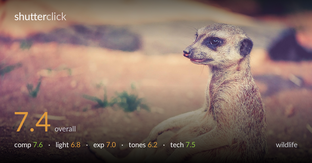
A genuinely engaging behavioural moment — the relaxed, almost human seated pose of the meerkat carries the frame, and the eye is sharp where it counts. The reclined posture and slight turn of the head give character that elevates this above a static portrait. What most holds it back is the heavy, faded colour treatment: the pink-leaning white balance and lifted blacks flatten contrast and rob the fur of its natural warmth and depth. The placement on the right works with the negative space to the left, but the background is busy enough in the upper portion to compete slightly. Strong subject, undermined by the grade.
Placing the subject on the right third and letting it gaze and recline into the open left space is a sound choice — the negative space gives the pose room to breathe and reads as deliberate. The low, near-ground perspective puts the viewer at eye level, which suits wildlife well. The diagonal of the outstretched legs leads nicely into the frame. The upper background, however, is cluttered with out-of-focus rock and shadow shapes that pull attention; a slightly tighter top crop would settle the frame and strengthen the subject's dominance.
The light is soft and directional, coming from the upper left, which models the face and fur gently and keeps the eye readable with a faint catchlight. It avoids the harsh midday contrast that often plagues enclosure shots. However, the overall illumination is fairly flat and lacks the raking quality that would carve out the texture of the dense fur. The brightest highlights on the back edge are pleasant but underdeveloped. A lower-angle warm light would have given more separation and dimensionality to the coat.
Exposure is handled competently — the subject sits at a comfortable midtone brightness, the eye retains detail, and there is no significant highlight clipping on the lit fur. Shadow detail in the darker eye patches and ground holds together. The faded look comes partly from a deliberate lift in the blacks rather than underexposure, so the dynamic range is being used but compressed. The histogram likely sits centred and narrow. A touch more contrast in the rendering would have made the exposure feel more decisive and less washed.
This is the weakest element. The grade pushes a heavy pink-magenta cast across the sand, fur, and background, draping a uniform pastel film over the whole frame that reads as a vintage filter rather than a natural rendering. The blacks are lifted, midtones are muddy, and the meerkat's warm browns and silvery guard hairs are muted into a flat salmon tone. White balance leans warm-magenta well beyond the scene. Pulling back the magenta, restoring true neutrals in the sand, and adding mid-tone contrast would let the fur regain its richness.
Focus is placed accurately on the near eye, which is the critical plane for wildlife, and it holds sharp with good rendering of the surrounding facial fur. Depth of field appears moderately shallow — enough to dissolve the background into a soft wash while keeping most of the body acceptably sharp, suggesting a sensible aperture and a moderate-to-long focal length that compresses the scene and yields pleasing background separation. There is no visible motion blur, so shutter speed was sufficient for this still subject, and noise is well controlled. The fur texture along the back and chest is resolved cleanly without over-sharpening artefacts. The main technical limitation is not capture but the post-processing: the soft, faded grade slightly masks the underlying sharpness the lens delivered. The slightly busy out-of-focus background in the upper frame is a positioning choice as much as an optical one — a wider aperture or a different angle would have rendered it cleaner and more uniform.
what would elevate it
tags
Shot something like this?
Expert photo critique, on demand — scored across six categories, EXIF-aware. Start with 3 free critiques, no credit card.
critique my photo — free