A nun among the colonnade
Photo by DUCTINH91

No EXIF metadata in this file
Technical analysis based on visual assessment only.
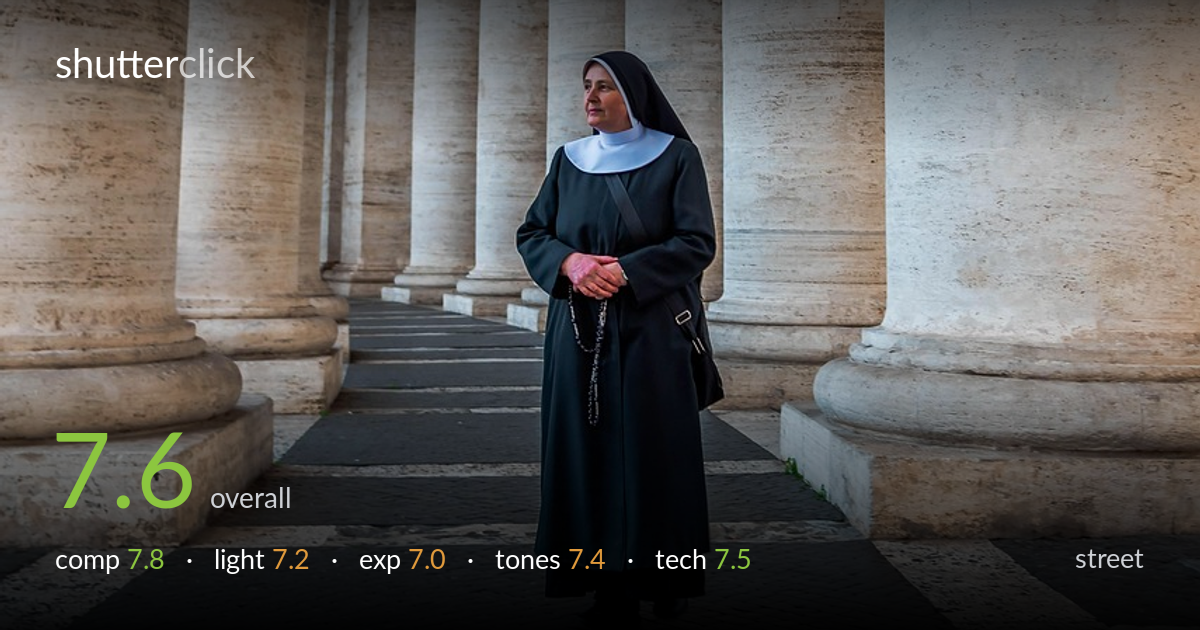
A strong sense of place anchors this frame: a nun in dark habit set against the massive travertine columns of Bernini's colonnade, the scale contrast doing real narrative work. The receding rows of columns form natural leading lines and a sense of solemn repetition that suits the subject. What most holds it back is exposure balance — the dark figure sits in shadow while the columns catch warmer light, leaving her face slightly underexposed and her habit losing detail. The downward gaze and clasped rosary read as a genuine quiet moment, which earns the slower, contemplative feel over a snatched candid.
The placement works well — the figure centred low between two foreground columns, with the colonnade receding to the left as a powerful set of leading lines. The checkerboard paving adds geometric counterpoint and grounds her. The dark habit reads cleanly against the pale stone, strong tonal separation. The vertical format suits the towering columns and the standing figure. A slight tightening from the top, where empty column tops dominate, would shift more weight to the subject and the receding corridor without losing the sense of monumental scale.
Soft, diffused ambient light under the portico gives even, shadowless rendering on the stone — flattering to texture but flat on the figure. The columns to the left catch a warmer, brighter wash, while the subject sits in cooler shade, which slightly dulls her face and the form of the habit. A position catching even a sliver of directional light on her face would have added modelling and a catchlight. As is, the light reads as documentary-honest rather than shaped, fitting the quiet mood.
Exposure favours the bright stone, leaving the dark habit and face a touch underexposed — the black fabric reads as a near-flat mass with little fold detail, and the face lacks the lift it needs to anchor the eye. Highlights on the columns are well controlled with no obvious clipping, and shadow detail in the paving holds. Lifting the subject's midtones a half-stop in post, or metering for her rather than the stone, would bring her forward without blowing the architecture.
The warm travertine against the cool near-black habit makes a pleasing, restrained palette — muted and dignified, matching the subject. White balance leans slightly warm on the stone, which flatters it. Contrast is moderate and the midtone gradation across the columns is smooth. The habit risks crushing toward pure black in places, costing texture. A touch more separation in the deep tones would recover fabric detail, and a marginally cooler grade on the figure would resolve the slight warm-cool tension between subject and background.
Focus appears accurate on the figure, with the face and habit acceptably sharp and the foreground paving rendered crisply — judging from the visible depth, the aperture was chosen to keep both the subject and the surrounding architecture in reasonable focus, which is the right call for an environmental street portrait where context matters. There is no visible motion blur; the standing, contemplative pose is held cleanly. Noise is well controlled across the shadow areas of the habit, suggesting a sensible ISO. The wide-ish framing captures the colonnade's scale without obvious distortion on the verticals, and the columns stay reasonably upright. The main technical limitation is the underexposed subject relative to the background, which is a metering and exposure choice rather than a focus or sharpness fault. A slightly faster recovery of the dark tones in processing, or spot-metering on the face at capture, would have closed the gap between competent and clean execution here.
what would elevate it
tags
Shot something like this?
Expert photo critique, on demand — scored across six categories, EXIF-aware. Start with 3 free critiques, no credit card.
critique my photo — free