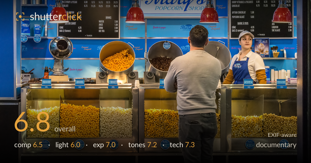
A quiet moment at the popcorn counter
Photo by Wilfredor

| Focal length | 35 mm |
| Aperture | f / 8.0 |
| Shutter | 1/250 s |
| ISO | ISO 3200 |
| Exp. comp. | 0.0 EV |
| Shot at | 18:32 · Oct 14, 2017 |
A clean, well-observed slice of retail life that reads instantly and lets the vivid blue-and-red storefront do the work. The exchange between the customer and the attendant gives the frame a human anchor, and the symmetry of the two menu boards and pendant lamps builds order. What holds it back is the moment itself: the interaction is static and the customer's back gives nothing away — no gesture, no visible transaction, no peak instant. The scene documents the place well but stops short of a story. A caught glance, a hand pointing at the board, or product changing hands would lift it from record to narrative.
The frame is built on strong repetition — twin menu boards, paired red pendants, and the row of glowing popcorn bins form a stable, almost symmetrical grid. The customer's centred back anchors the scene and directs the eye toward the attendant, who sits nicely off-centre near a third. The bright signage in the middle competes for attention, though, pulling weight away from the human exchange. The customer's dominant grey mass blocks a chunk of the counter. A slightly higher angle or a step left would open the interaction and reduce the dead central block.
Lighting is flat, even interior illumination typical of a mall food stall — functional but undramatic. The red pendant lamps promise warmth yet contribute little modelling, and the internally lit bins provide the most character, glowing from within. Faces receive soft, directionless light that keeps the attendant readable but lifeless. The overhead fluorescent panel top-left is a harsh, distracting bright patch. Nothing here shapes the subjects or builds mood; the light records rather than reveals. Waiting for a moment when a face catches the warmer pendant glow would add depth.
Exposure is well controlled across a tricky range of bright signage, glowing bins, and darker counter shadows. Highlights on the central Mary's sign and the ceiling fluorescent are near clipping but hold just enough. The popcorn bins retain colour and texture rather than blowing out, and shadow detail under the counter stays open. Midtones on the grey sweater and blue apron sit naturally. The overall balance looks deliberate and even, with no accidental murk. A touch of highlight recovery on the sign panel would tidy the brightest zone.
Colour is the image's real strength — the saturated cyan-to-royal blue backdrop plays vividly against the red lamps and the warm yellows and caramels of the popcorn, a punchy complementary palette that carries the shop's identity. White balance reads neutral and clean, with whites in the cups and signage staying honest. Contrast is healthy without crushing. The saturation flirts with being pushed, particularly in the blues, which risk looking synthetic. Dialling the blue channel back slightly would keep the vibrancy while restoring a more natural feel.
The settings are sensibly chosen for a deep, product-filled scene. At f/8 the depth of field carries sharpness from the front bins through to the back menu boards, which is exactly right for a documentary record where legibility of the whole space matters. The 35mm on the DX body gives a natural ~52mm-equivalent field that avoids distortion and keeps the geometry honest. Focus lands accurately on the counter and attendant. The 1/250s shutter easily freezes the quiet activity. ISO 3200 is the compromise for the interior light, and while noise is controlled well enough at web size, fine detail in the shadow areas and the darker chocolate bin softens under noise reduction. Since nothing in the frame moves fast, dropping to 1/125s would have allowed ISO 1600 for cleaner shadows without risking blur. Overall execution is competent and reliable — the technical decisions serve the scene rather than fighting it.
What would elevate it
Tags
Shot something like this?
Expert photo critique, on demand — scored across six categories, EXIF-aware. Start with 3 free critiques, no credit card.
critique my photo — free