A quiet moment on the threshold
Photo by sdg_Rai

No EXIF metadata in this file
Technical analysis based on visual assessment only.
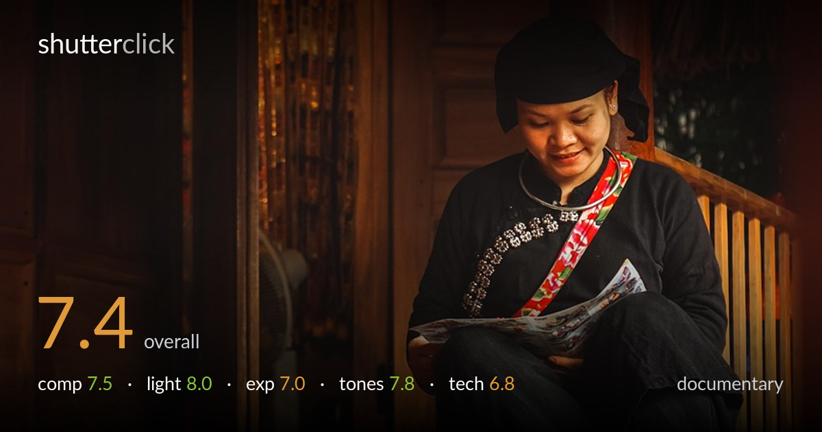
A quiet, observant frame that earns its documentary intent through atmosphere and a genuine moment. The woman reading on the threshold, barefoot, in traditional dress against a warm wooden interior, carries real cultural specificity and sense of place. Warm tones and the soft directional window light do most of the heavy lifting. What holds it back is the very dark foreground floor consuming the lower third, a slightly soft rendering of the face, and a low shooting position that adds a blurred plank across the bottom edge without payoff. The story is strong; the execution needs a touch more discipline.
Subject placement on the right works well, set against the rhythm of wooden doors and balustrade. The snack package at lower left adds context and a small narrative anchor. The low angle gives intimacy but the foreground plank eats roughly a quarter of the frame with little detail or purpose, weighting the composition heavily downward. The diagonal of the step edge leads the eye nicely toward the figure. A slightly higher viewpoint or a tighter crop from the bottom would concentrate attention where the moment actually lives.
The soft window light raking from the left across the woman's face and hands is the photograph's strongest asset, modelling her features gently and lending the wood a warm glow. Shadow falloff into the dark interior creates depth and mood without feeling murky in the subject area. The light feels found rather than arranged, which suits documentary work. The only caution is that the contrast between lit subject and dark surrounds is steep, pushing the foreground into near-blackness that the frame could use more readably.
Exposure is judged for the subject, holding her face and the magazine without clipping the brighter wood. The trade-off is heavy shadow in the foreground floor and the left-hand interior, where detail collapses into black. Some of this serves the mood, but the lower third reads as accidental darkness rather than deliberate negative space. The highlights on the wood roll off cleanly. Lifting the shadows modestly in post would recover floor texture and balance the frame's tonal weight more convincingly.
The warm, amber palette is the image's signature, unifying wood, skin, and ambient glow into a cohesive, inviting mood. White balance leans warm, which flatters the scene without tipping into orange excess. The red and patterned sash provides a welcome accent against the dominant black of the clothing. Contrast is on the high side, which deepens atmosphere but at the cost of shadow separation. Mid-tone gradation in the lit wood is handsome. A touch less warmth could keep the skin tones more natural.
Focus appears to land just behind the ideal plane; the woman's face reads slightly soft where critical sharpness on the eyes and downward gaze would have anchored the documentary connection more firmly. Depth of field is shallow enough to render the background doors pleasantly diffuse, which helps separation, but the same shallowness leaves the foreground plank an indistinct smear across the bottom edge, adding no information. Noise is controlled in the lit areas, though the deep shadows likely hide some that would surface if lifted. The low shooting position is a deliberate choice that buys intimacy and the strong floor diagonal, but it introduces that foreground obstruction without compensating detail. Handheld stability looks adequate; there is no obvious motion blur on the subject. A slightly smaller aperture, or focus placed precisely on the face, would have sharpened the moment that matters while keeping the environmental context legible. The overall capture is competent but a notch short of crisp.
what would elevate it
tags
Shot something like this?
Expert photo critique, on demand — scored across six categories, EXIF-aware. Start with 3 free critiques, no credit card.
critique my photo — free