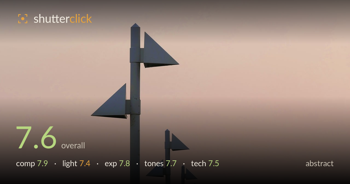
A receding line of markers at dusk
Photo by Kranich17

No EXIF metadata in this file
Technical analysis based on visual assessment only.
A clean, disciplined graphic study — a receding line of triangular markers against a soft gradient sky, built entirely on repetition and diminishing scale. The strength is the rhythm: identical forms shrinking into the distance create a satisfying visual cadence and a strong sense of depth from an essentially flat subject. What holds it back is that the largest foreground pole sits close to centre-left and slightly dominates, and the vast upper-right sky, while atmospheric, is a large expanse doing little work. The muted dusk palette suits the minimal treatment well. A frame that leans harder into either the receding curve or the negative space would sharpen the intent.
The diminishing chain of markers is the engine here — repeating triangles curving off toward the lower-right corner build genuine depth and rhythm from flat forms. The tall foreground pole anchors the eye well and establishes scale. Placement is slightly awkward, though: the dominant pole sits just left of centre while the receding line sweeps right, leaving the upper-right sky as a large, near-empty field. That negative space reads as intentional minimalism but could carry more tension if the foreground element were pushed further into a third.
Soft, diffused dusk light does the atmospheric work, wrapping the metal forms in flat, shadowless illumination that keeps them reading as clean silhouetted shapes against the gradient. The absence of hard directional light suits the graphic, pared-back intent — texture is irrelevant here, form is everything. The trade-off is that nothing on the poles is modelled or sculpted; they render as flat grey cutouts. That's a defensible choice for abstraction, but a hint of raking warmth would have added dimension to the leading marker.
Exposure is well judged for a delicate high-key gradient. The sky retains smooth tonal transition with no obvious clipping in the brightest upper zone, and the grey poles hold enough separation from the background to stay legible without crushing into pure black. Midtones sit gently, preserving the soft dusk mood. The overall brightness reads deliberate rather than accidental — a controlled, airy key that matches the minimal subject. There's a touch of low-contrast flatness, but that appears to be an intentional atmospheric choice.
The muted peach-to-mauve gradient is the tonal centrepiece and it's handled with restraint — a smooth, pollution-tinged dusk wash that gives the cool grey markers something warm to sit against. The complementary relationship between warm sky and neutral steel is quietly effective. Contrast is deliberately low, keeping everything soft and painterly. The only reservation is that the palette skirts monotony; the poles could use marginally more tonal separation from the darker sky at the bottom-right where the smaller markers begin to merge into the background.
Focus is accurate on the leading pole and its two triangular flags, with crisp edges on the forms that matter most. Depth of field appears sufficient to hold the receding chain reasonably sharp, though the smallest, most distant markers naturally soften — acceptable and even helpful for the sense of recession. No visible motion blur, and noise is well controlled across the clean sky, which is where luminance noise would show first in a gradient like this. Sharpness across the frame is consistent enough that the graphic intent survives. The lens choice renders the perspective compression convincingly, stacking the poles into a tightening line. The main technical limitation is the flat rendering of the metal itself — that's a lighting condition rather than an execution fault. Cleaner edge definition on the darkest lower-right markers, whether through a fractionally faster shutter to eliminate any micro-vibration or slightly more separation in processing, would tighten the far end of the chain. Solid, deliberate capture overall.
What would elevate it
Tags
Shot something like this?
Expert photo critique, on demand — scored across six categories, EXIF-aware. Start with 3 free critiques, no credit card.
critique my photo — free