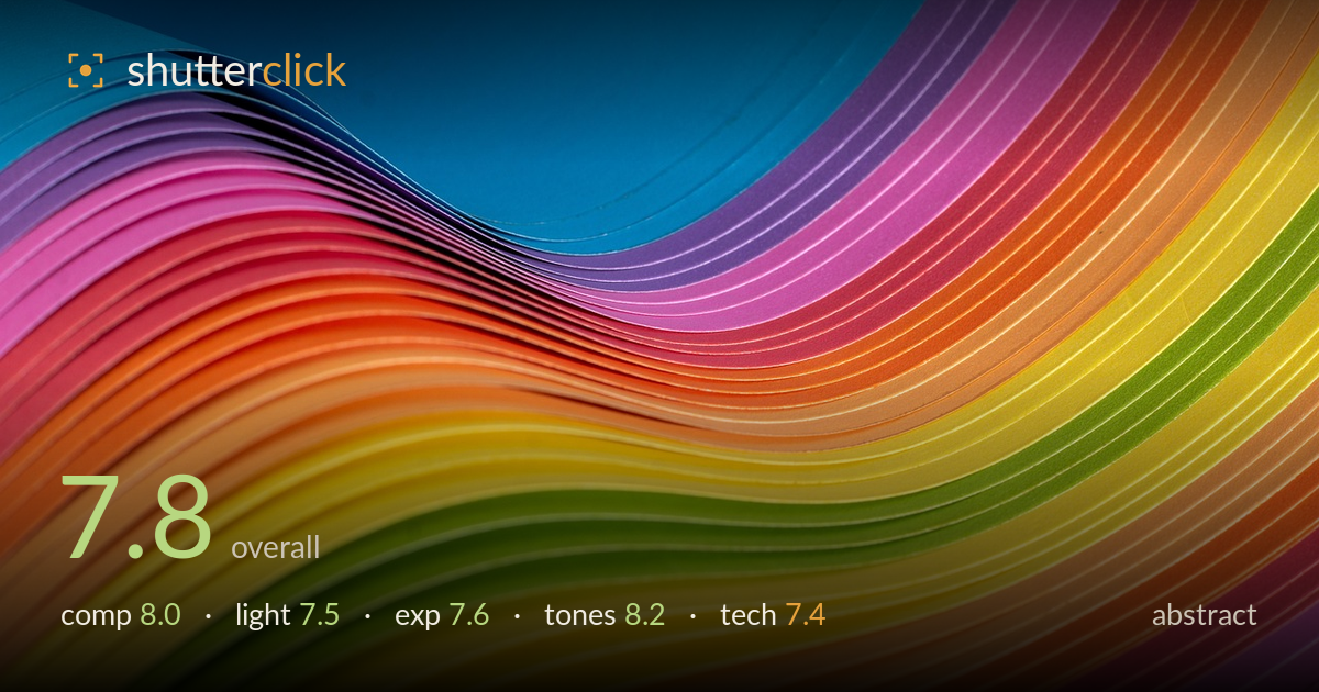
A wave of rainbow paper
Photo by sergiovisor_ph

No EXIF metadata in this file
Technical analysis based on visual assessment only.
A confident study of colour and flow, its strength is the S-curve rhythm of stacked paper reading as a wave against clean negative space. The full spectrum sequence gives the frame both order and energy, and the sweeping line carries the eye through the diagonal. What most holds it back is the focus falloff: only a narrow band of edges is truly crisp, and the softness toward the extremes reads less as intentional bokeh than as a plane not quite held. The blue negative space at top is generous to the point of feeling slightly empty on one side.
The stacked sheets form a strong S-curve that sweeps from lower left up through the frame, giving genuine movement and rhythm. The blue negative space at top balances the dense colour band well and lets the wave breathe. The eye follows the fanned edges naturally along the diagonal. The one weakness is the top-right corner, where colour crowds to the edge while the top-left stays open — a slightly asymmetric balance. A hair more space below the wave's crest would strengthen the sense of flow.
The light is soft and even, which suits the smooth paper surfaces and keeps the colours clean without hot spots or blown edges. It gently models the curve of each sheet, giving the stack subtle dimensionality along the fan. What it lacks is a raking, directional quality that would carve the individual edges into sharper relief and add depth to the ridges. The flat, frontal feel keeps the image graphic rather than sculptural — fine for the intent, but a touch more shaping light would add drama.
Exposure is well controlled across a demanding range of saturated hues. The bright yellows and pinks hold their edges without clipping, and the blue background retains detail in its darker zones. Midtones sit comfortably, letting each colour register at full strength. There is little to fault technically, though the deepest blue toward the upper reaches drifts slightly muddy where the falloff meets shadow. A marginally brighter placement there would keep the whole frame reading as vividly as the foreground band.
This is the image's strongest suit. The full spectrum sweep — blue into violet, pink, orange, yellow, green — is rendered with rich, believable saturation that never tips into garish oversaturation. White balance is neutral, letting each hue read true, and the transitions between adjacent colours are smooth. Contrast between the cool blue field and the warm band gives the frame its punch. The tonal separation between similar hues, like the pinks and reds, stays clean and distinct rather than blocking up.
The shallow depth of field is the defining technical choice here, and it works only partially. A band of edges through the mid-frame is genuinely sharp, showing the fine cut texture of each sheet, but the focus falls off toward both the lower foreground and the upper reaches, leaving significant portions soft. For an abstract built on the repetition of crisp edges, that falloff undercuts the graphic precision the subject invites — the eye wants each fanned edge to be resolved. A narrower aperture, or a focus-stacked pair of frames, would hold the entire curve sharp and let the pattern read fully. Noise is well controlled and the colour rendering is clean, suggesting a low ISO and careful capture. The framing plane is well chosen to catch the wave at its most dynamic. Overall the execution is competent, but the depth-of-field decision leaves the image less resolved than its own composition demands.
What would elevate it
Tags
Shot something like this?
Expert photo critique, on demand — scored across six categories, EXIF-aware. Start with 3 free critiques, no credit card.
critique my photo — free