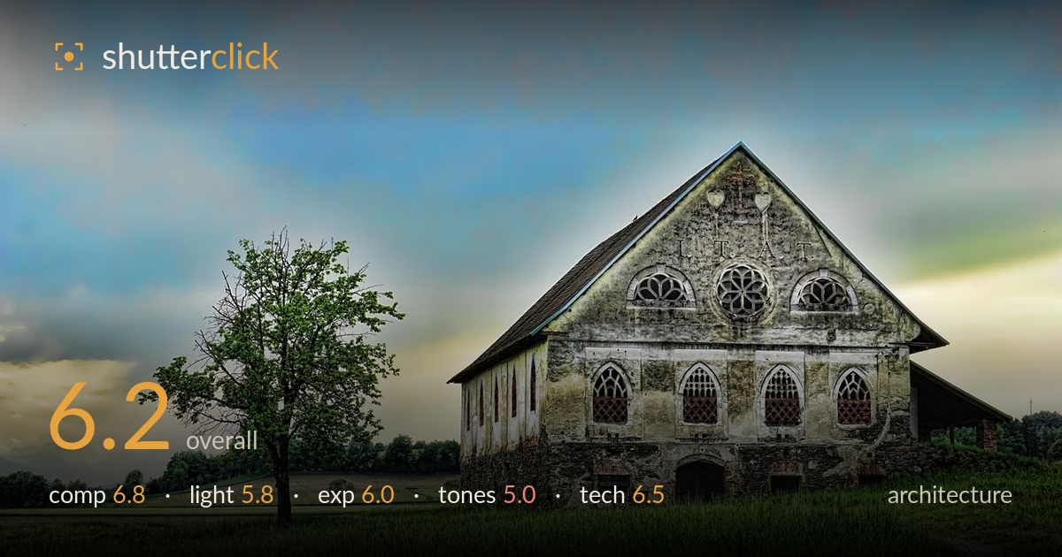
Abandoned house across the meadow
Photo by Schwoaze

No EXIF metadata in this file
Technical analysis based on visual assessment only.
A characterful abandoned building with strong Gothic-arched detailing, undermined most by heavy-handed HDR processing that flattens the tones and lends the sky an artificial, plasticky quality. The composition works: the lone tree on the left balances the mass of the building on the right, and the path draws the eye in from the lower corner. But the tone mapping crushes local contrast, oversaturates the grass into a uniform acid green, and gives edges a faint halo. Dialing back the effect and correcting verticals would let the genuinely interesting subject speak for itself. The bones of a compelling architectural image are here.
The building anchors the right two-thirds while the solitary tree counterbalances the left — a satisfying weight distribution. The diagonal path entering from the bottom-right corner leads the eye toward the structure, and the receding hills add depth on the left. The gable is placed well and given room above. The tree, however, sits slightly awkwardly with its crown clipping into busy mid-ground foliage, and the far-right eave of the roof runs close to the frame edge. A touch more breathing room on the right would settle the structure.
The light is flat and diffuse, with no clear directional modeling to carve the building's texture or the Gothic tracery. This softness is compounded by aggressive tone mapping that lifts shadows everywhere, eliminating the depth that raking side light would give the weathered facade. The sky suggests an overcast or transitional moment with some warmth low on the left horizon, but it never resolves into usable directional interest. Early or late side light skimming across the plaster would reveal the surface decay far more dramatically.
Overall brightness is reasonable and the histogram appears well-contained with no severe clipping — highlight detail survives in the pale plaster and the sky retains tone. The HDR merge has, however, compressed the dynamic range so heavily that the image reads as tonally uniform: shadows under the eaves and in the doorways are lifted to the point of looking unnaturally open. The result is technically detailed but lacks a true black point, leaving the image feeling slightly weightless and washed at the deep end.
This is where the image struggles most. The tone mapping oversaturates the grass into a single flat, artificial green and pushes the sky toward a synthetic teal-and-cream palette that reads as processed rather than natural. Local-contrast enhancement produces micro-halos around the roofline and tree. White balance drifts cool overall while the low horizon glows warm, creating an unresolved split. Pulling back saturation, restoring a genuine black point, and reducing clarity/structure would return believability and let the plaster's subtle tonal variation show.
Sharpness is adequate across the frame and focus appears accurate on the building, with the delicate window tracery holding detail well — a good sign for depth of field, which seems sufficient to keep both tree and structure acceptably crisp. The lens choice renders the subject at a natural perspective without obvious wide-angle distortion. The main technical liability is post-processing rather than capture: the HDR tone mapping introduces edge halos and an over-worked texture that betrays heavy structure/clarity sliders. Verticals show mild convergence — the building's side walls lean slightly inward — which stricter architectural work would correct with a tilt-shift lens or perspective correction in post. Noise is not a visible issue. The core exposure and focus decisions are sound; a lighter processing hand and a perspective fix would elevate the technical execution considerably. Overall the capture is competent, and the flaws are recoverable in reprocessing from the source file.
What would elevate it
Tags
Shot something like this?
Expert photo critique, on demand — scored across six categories, EXIF-aware. Start with 3 free critiques, no credit card.
critique my photo — free