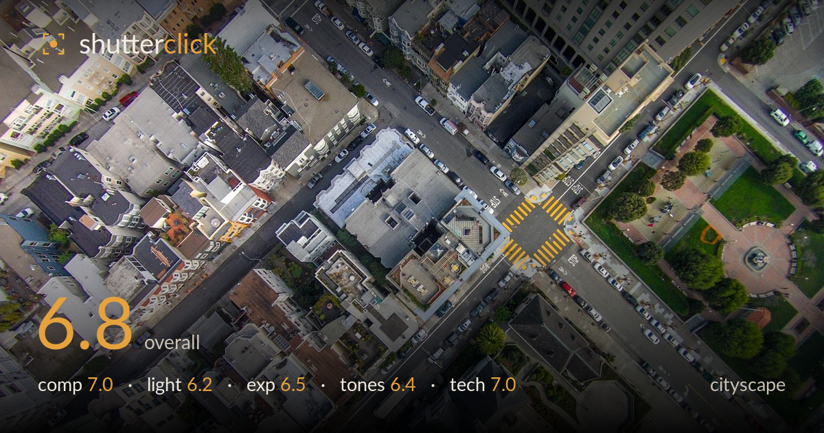
Aerial view over a city crossroads
Photo by derwiki

No EXIF metadata in this file
Technical analysis based on visual assessment only.
A top-down aerial that turns a city intersection into a study of converging streets and geometry — the strongest asset is the way the two roads and crosswalks form an X that pulls the eye across the frame. The green park block on the right adds welcome relief from the dense grey rooftops. What holds it back is flat, overcast light that leaves the tone uniformly muted and low in contrast, and a busy field of rooftops with no single dominant anchor. Tighter framing on the intersection and a punchier grade would sharpen the impact considerably.
The diagonal streets meeting at the tiled crosswalk create a natural X that organises an otherwise chaotic sprawl of rooftops, and the green park at right balances the dense built texture. The nadir viewpoint is committed and consistent. However, the intersection — the clear focal point — sits high and slightly right rather than commanding the frame, and the lower half is dominated by a dark spired roof that competes for attention. A crop tightening on the crossroads would concentrate the geometry and reduce the visual noise of repetitive rooftops.
Soft, diffused overcast light renders the entire scene evenly, which keeps rooftop detail readable but drains the image of modelling and depth. Shadows are shallow and non-directional, so the vertical relief of buildings flattens into a map-like plane. The orange crosswalk stripes and park greenery are the only elements with real punch. Raking, low-angle light near golden hour would cast building shadows across the streets, restoring three-dimensionality and separating the stacked rooftops from one another. As shot, the light is functional but undramatic.
Exposure is broadly well controlled — highlights on the pale rooftops hold detail without clipping, and the darker spired roof retains shadow information. Midtones sit reasonably placed, keeping the grey urban fabric legible. The overall rendering is a touch flat and slightly dark in the densest shadow pockets between buildings, where detail muddies. There is no obvious blown area. A modest lift in the deepest shadows and a small highlight recovery on the brightest white roofs would open the tonal range without pushing anything to clipping.
The palette is dominated by cool greys and muted concrete, broken only by the park's green and the orange crosswalk paint. White balance reads slightly cool and a little flat, which suits the overcast conditions but leaves the frame feeling drab. Contrast is low, so the many rooftops blend into one another tonally. A grade with a touch more contrast and gentle warmth in the midtones would separate surfaces and give the greys life, while the existing green and orange accents already provide useful colour punctuation.
Sharpness is solid across the frame for an aerial capture, with rooftop edges, cars, and crosswalk lines cleanly resolved, suggesting a stable platform and adequate shutter speed to counter drone motion. Depth of field is effectively infinite at this altitude, which is correct for the subject — everything is meant to be in focus, and it is. Noise is well controlled in the shadow areas, indicating a sensible ISO. The nadir angle is held cleanly with no obvious tilt, which matters for a top-down composition where any skew would read as a mistake. The main technical limitation is not gear but timing: the flat light gives nothing for the resolution to work with. Some very fine detail in the darkest roof valleys softens into mush, likely a combination of shadow compression and slight processing. Overall the execution is competent and clean; the image is technically sound and lets the composition, rather than any flaw, carry the result.
What would elevate it
Tags
Shot something like this?
Expert photo critique, on demand — scored across six categories, EXIF-aware. Start with 3 free critiques, no credit card.
critique my photo — free