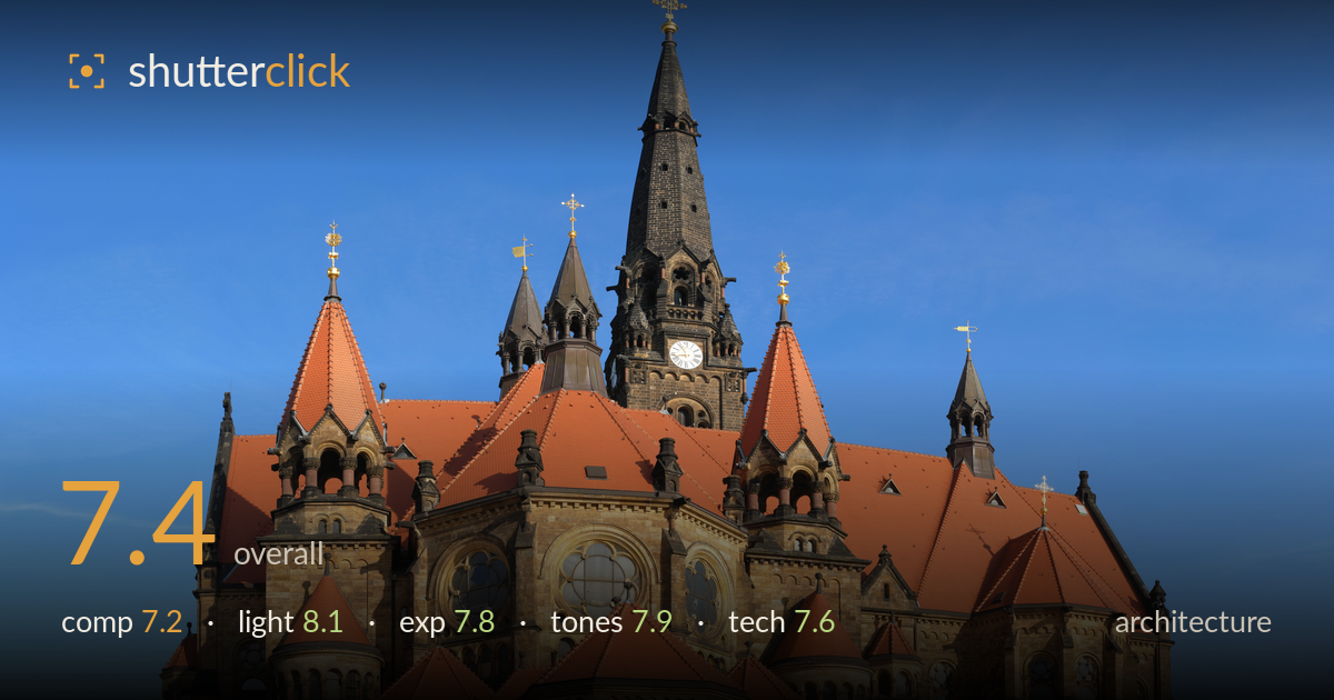
Afternoon light on a stone church
Photo by User:Kolossos

No EXIF metadata in this file
Technical analysis based on visual assessment only.
A clean, well-lit record of a substantial Romanesque Revival church that succeeds mainly on the strength of its light and colour. Warm afternoon sun rakes across the sandstone and lifts the terracotta roofs against a deep blue sky, giving the stone real dimension. What most holds the image back is the near-frontal, slightly elevated framing that flattens the building's mass and leaves a large empty foreground of scrubby grass and a dirt path doing little compositional work. The verticals are largely upright, but tighter attention to foreground and a stronger corner-on angle would give the structure more depth and presence.
The building sits centred and mostly upright, which suits a documentary record, but the near-frontal three-quarter view stacks the towers and roofs into a busy silhouette that reads as clutter rather than clear hierarchy. The central spire is comfortably placed with breathing room above the cross. The lower third is dominated by featureless grass and a dirt path that adds no interest and pulls weight downward. A lower shooting position or a stronger corner-on angle would separate the volumes and give the massing more three-dimensional depth.
This is the image's strongest asset. Low, warm afternoon sun rakes across the facade from the left, modelling the sandstone masonry and pulling texture from every arch, gable and turret. The terracotta roofs glow without burning out, and the gilded crosses catch the light cleanly. Shadow direction gives the projecting bays genuine relief rather than a flat wash. The timing was well judged for the deep saturated sky. Only the shadowed right flank falls a touch flat, but that is a minor consequence of a single-source raking light.
Exposure is well controlled across a demanding range. The bright terracotta roofs hold texture without clipping, and the sunlit stone sits at a natural brightness. Shadow areas on the shaded flanks and under the eaves retain readable detail rather than blocking up. The sky is deep and clean with no evidence of blown highlights around the spire. The darker slate spire retains form against the sky. Midtones on the sandstone are placed convincingly. A whisper more shadow lift on the right side would even the read, but nothing here looks accidental.
The colour palette is the image's signature: warm ochre sandstone and vivid terracotta roofs set against a saturated gradient blue sky. White balance leans warm, which flatters the stone at this hour and feels intentional. Contrast is healthy without crushing detail, and the tonal range spans dark slate spire to bright roof cleanly. The blue may be a touch heavy-handed near the top edge, hinting at slight polarizer or saturation push, but it stays believable. Overall the grading is coherent and complements the golden light.
Sharpness is solid across the frame, with fine masonry detail, roof tiles and window tracery all cleanly resolved, suggesting a well-chosen aperture and careful focus placement across the depth of the building. There is no obvious motion blur or noise, consistent with good light and a low ISO. The verticals are largely corrected — the towers rise close to true, which points to either a level shooting position or competent perspective correction in post, an important discipline for architecture. Some minor keystoning remains toward the frame edges where the outermost turrets lean slightly inward, worth tightening for strict architectural rendering. The wide framing captures the full structure but includes a lot of low-value foreground that a slightly longer focal length or repositioning could trade for more building. Depth of field is clearly sufficient to hold the whole facade sharp. Overall this is competent, disciplined execution; the remaining gains lie in perspective refinement and framing choices rather than resolution or focus.
What would elevate it
Tags
Shot something like this?
Expert photo critique, on demand — scored across six categories, EXIF-aware. Start with 3 free critiques, no credit card.
critique my photo — free