Alone among the parking lines
Photo by harutmovsisyan

No EXIF metadata in this file
Technical analysis based on visual assessment only.
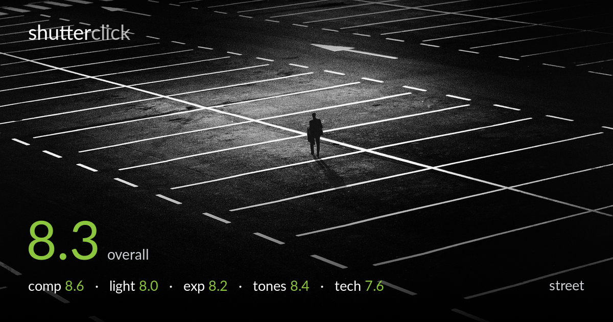
A lone figure placed at the convergence of painted parking lines turns an ordinary lot into a graphic study of isolation. The geometry does the heavy lifting — radiating lines pull the eye straight to the small silhouette and its cast shadow, and the surrounding emptiness amplifies the solitude. The pool of light landing exactly where the figure stands is a fortunate, well-seen moment. What holds it back slightly is the elevated, slightly detached vantage that flattens the scene, and a figure rendered so small it risks being lost against the busy line pattern. Strong, intentional, atmospheric work.
The painted lines form a natural starburst of leading lines that converge precisely on the figure — a textbook use of geometry to direct the eye. Placing the subject near centre works here because the radiating lines and the pool of light reinforce that placement rather than fighting it. The negative space of dark asphalt sells the isolation. The cast shadow adds welcome vertical anchoring. The one weakness is the dense field of competing lines around the figure, which slightly camouflages an already tiny subject.
The single patch of brighter ground falling around the figure is the photograph's quiet miracle — it isolates the subject within an otherwise uniformly dark field and makes the silhouette read instantly. Light direction also rakes across the painted lines, lifting them to bright white against the asphalt. The overall low-key treatment suits the mood of emptiness. The light is somewhat flat and ambient rather than dramatically directional, so the figure stays a flat silhouette without modelling, which is acceptable but limits depth.
Exposure is judged for mood rather than detail, and the decision reads as deliberate. The asphalt holds enough mid-tone texture to avoid blocking into featureless black, while the painted lines stay clean white without obvious clipping. The figure sits as a true silhouette, which serves the concept. Shadows roll into deep black at the frame edges, which strengthens the vignette-like containment. A touch more shadow lift might reveal more ground texture, but the current placement keeps the eye where it belongs.
The black-and-white conversion is the right call — colour would only clutter this graphic scene. Contrast is high and purposeful, with crisp white lines against near-black asphalt and convincing mid-tone gradation across the lit ground. The grain adds a gritty, documentary texture that suits the subject. Shadow depth is rich without being crushed flat everywhere. Highlight roll-off on the painted lines stays controlled. The tonal separation between the lit centre and dark surrounds gives the image its mood and structure.
From visible evidence, focus appears accurate across the painted lines, with the surface texture and grain rendering sharply throughout — consistent with a deep depth of field appropriate to this kind of wide, geometric scene. The figure, being a small dark silhouette, gives little to confirm critical focus, but nothing reads as soft. There is visible grain in the asphalt, which here functions as aesthetic texture rather than a flaw, though some of it likely stems from working in low light or pushing the shadows. Motion is frozen cleanly — no blur on the figure despite the walking pose — suggesting an adequate shutter speed. The elevated shooting position is the most consequential choice: it earns the graphic top-down read of the lines but flattens spatial depth and distances the viewer from the subject. A slightly longer focal length to enlarge the figure, or a lower angle, would each trade some of that geometric clarity for presence. Overall execution is clean and controlled.
what would elevate it
tags
Shot something like this?
Expert photo critique, on demand — scored across six categories, EXIF-aware. Start with 3 free critiques, no credit card.
critique my photo — free