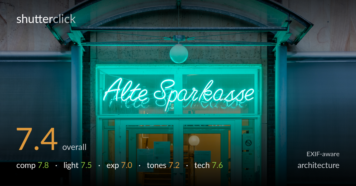
Alte sparkasse glowing at dusk
Photo by Dietmar Rabich

| Focal length | 43 mm |
| Aperture | f / 8.0 |
| Shutter | 1/10 s |
| ISO | ISO 200 |
| Exp. comp. | -3.0 EV |
| Shot at | 06:52 · Feb 5, 2021 |
A clean, symmetrical study of an illuminated entrance at blue hour, anchored by the glowing neon sign and the warm interior staircase that draws the eye through the glass. The frontal, centred approach suits the subject and the colour interplay — cyan light against the warm core — gives the frame real atmosphere. What holds it back most is the lone bollard splitting the doorway dead-centre, an awkward distraction the eye keeps catching. Verticals are largely true, but the brick base sits a touch heavy and some highlight detail in the neon and interior is lost. A strong, repeatable concept with a few correctable snags.
The frontal, symmetrical framing is the right instinct for this entrance, stacking the upper windows, the arched canopy, the neon sign and the glass doors into an ordered vertical hierarchy. The warm staircase pulls the eye through the centre, anchoring the composition. The single bollard rising into the doorway, however, lands almost exactly on the centre line and reads as an intrusion rather than a deliberate element. The foreground paving occupies a large, fairly empty lower third; tightening that or finding interest there would strengthen the base.
The blue-hour timing is well chosen — ambient light has dropped enough for the neon to dominate and cast its cyan glow across the canopy and glass while the sky retains faint detail. The contrast between the cool exterior wash and the warm tungsten interior is the image's strongest asset, giving depth and a clear focal pull. The flat frontal nature of the available light leaves the brick and stone facade somewhat textureless, but for this subject the artificial-light balance carries the mood convincingly.
The -3.0 EV compensation was used to protect the bright neon, and broadly it works — the sign holds shape rather than blowing entirely. The brightest strokes of the lettering and the interior globe lamp still clip, losing fine detail there. The lower foreground and brick base sit quite dark, and the deep shadows have little recoverable information. Overall the placement is a reasonable compromise for a high-dynamic-range scene, though a bracketed blend would have held both the neon highlights and the shadowed paving more cleanly.
The cyan-versus-amber colour story is the heart of the frame and it reads with conviction. White balance is pushed cool to let the neon glow define the mood, which suits the subject, though it tips the brick and stone toward a slightly unnatural teal that flattens their material character. The warm interior provides necessary relief. Contrast is generally well handled, but the midtones in the facade feel a little muddy and the green cast on the foreground paving competes with rather than supports the lighting scheme.
Settings are sound for the conditions. At f/8 and 43mm the depth of field comfortably carries the facade plane sharp from the bricks to the sign, and ISO 200 keeps the file clean with no meaningful noise. The 1/10s shutter on what was clearly a tripod-stabilised shot is fine for a static subject, and focus appears accurately placed on the door plane. The 24-105 at this focal length keeps distortion modest. Verticals are close to true, suggesting either careful levelling or correction, though a minor check would confirm the doorframe is dead plumb. The main technical limitation isn't the capture but the dynamic range: a single -3 EV frame sacrifices shadow detail to tame the neon, where exposure bracketing and blending would have served this contrast-heavy scene better. The lens and body were more than capable here — the execution is competent and the choices defensible, with HDR technique the clearest avenue to a cleaner tonal result.
what would elevate it
tags
Shot something like this?
Expert photo critique, on demand — scored across six categories, EXIF-aware. Start with 3 free critiques, no credit card.
critique my photo — free