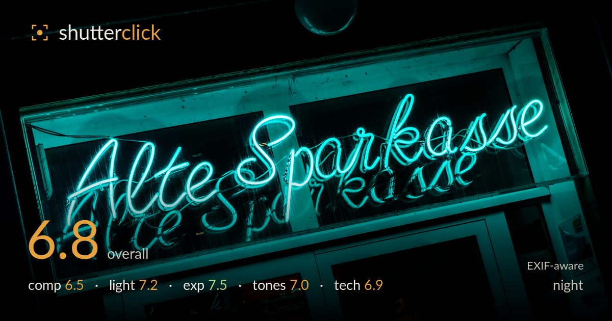
Alte sparkasse neon at night
Photo by Dietmar Rabich

| Focal length | 80 mm |
| Aperture | f / 8.0 |
| Shutter | 1/400 s |
| ISO | ISO 200 |
| Exp. comp. | -3.67 EV |
| Shot at | 06:57 · Feb 5, 2021 |
A confident, atmospheric neon study that lets the cyan glow of the cursive sign carry the frame against deep black surroundings. The self-illuminated subject is well controlled and the reflection of the script on the glass below adds a nice secondary layer. What most holds it back is the slightly awkward tilt and the intrusive dark sphere fixture at the top centre, which competes for attention without contributing. The framing crops the lettering close on the left, and the lower storefront detail muddies the bottom. Tighter, more deliberate framing and a levelled horizon would elevate an already striking colour and light study.
The diagonal sweep of the script gives energy, and the ghosted reflection beneath the sign is a genuine bonus that adds depth. Placement works reasonably against the enveloping black, but the dark hemispherical fixture dangling at top centre is a distraction that pulls the eye upward to nothing. The lettering also runs close to the left edge, feeling slightly cramped. The tilt reads as unintentional rather than dynamic. A cleaner frame that excludes the fixture or centres the sign more deliberately would give the composition the clarity its subject deserves.
The neon does the lighting work here, and it does it well — the tubes read as bright emissive sources without blooming out completely, and the spill washes the window frame and storefront below in a cohesive cyan. The self-illuminated subject against near-total darkness is exactly the kind of contrast night work thrives on. The reflection on the glass extends the light's presence downward. The only limitation is that everything outside the sign's throw falls to featureless black, flattening the scene's sense of place slightly.
The heavy -3.67 EV compensation was the right call — it protects the bright neon tubes from blowing out and lets the surroundings sink to black, which suits the mood. Highlight detail is largely retained in the glowing letters, and the shadows are deliberately crushed rather than accidentally lost. The storefront glass at the bottom holds just enough detail to register. The exposure decisions read as intentional throughout, with the balance tipped correctly toward preserving the sign rather than lifting the murk around it.
The dominant cyan is vivid and consistent, giving the image a strong, unified colour identity. The cooler neon plays nicely against the warm amber glimpses in the lower windows, a small but effective colour contrast. Saturation is pushed but stays believable for neon. The tonal range is intentionally compressed into bright highlights and deep blacks, which fits the genre. White balance leans cool overall; a touch more separation in the midtones would keep the darker glass areas from going slightly muddy where the cyan and black meet.
The settings are well chosen for the conditions. f/8 keeps the entire sign plane sharp, which matters given the diagonal run of the tubes across the frame, and focus lands accurately on the lettering. ISO 200 keeps noise negligible, appropriate since the bright neon needed no sensitivity boost. The 1/400 shutter is faster than necessary for a static subject — a slower speed would have allowed an even lower ISO or been redundant here, but it does no harm. At 80mm the lens compresses the storefront pleasingly and avoids distortion in the script. The main technical shortcoming is not a settings issue but framing execution: the slight tilt and the inclusion of the top fixture. Detail rendering in the tubes is clean without the halation that often plagues neon shots at wider apertures. Overall a technically sound capture where the gear was used sensibly, with the shutter the only mild over-specification.
What would elevate it
Tags
Shot something like this?
Expert photo critique, on demand — scored across six categories, EXIF-aware. Start with 3 free critiques, no credit card.
critique my photo — free