Alte sparkasse neon at night
Photo by Dietmar Rabich

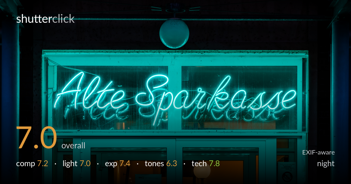
| Focal length | 105 mm |
| Aperture | f / 8.0 |
| Shutter | 1/125 s |
| ISO | ISO 200 |
| Exp. comp. | -2.67 EV |
| Shot at | 06:54 · Feb 5, 2021 |
A clean, symmetrical study of a neon storefront sign that reads instantly and holds the eye. The cursive 'Alte Sparkasse' is well placed across the upper third, and the warm doorway glow at the bottom adds a welcome counterpoint to the dominant cyan. What most holds the frame back is the near-monochrome teal cast — it flattens tonal separation and pushes the whole image toward a single hue. The dead space above the sign, while atmospheric, eats roughly a third of the frame without much payoff. A touch more colour balance and a tighter vertical crop would sharpen the impact considerably.
The frontal, symmetrical framing suits the architectural subject and the sign sits cleanly across the upper third with its reflection echoing below. The hanging globe lamp anchors the centre and the flanking pillars give containment. The lower warm doorway provides a useful secondary point of interest. The large dark band above the sign, however, is mostly empty and weakens the balance — it reads as headroom rather than intentional negative space. A slightly lower or tighter framing would let the sign and entrance carry more of the frame and tighten the geometry.
The light source is the subject itself, and the neon's even glow renders the script crisply against the dark glass. The reflected secondary glow on the surrounding glass and frame extends the light naturally through the scene. The warm tungsten spill from the doorway and the small globe lamp below provide essential contrast to the cold neon, keeping the image from feeling one-note. The upper structure falls into near-total shadow, which concentrates attention but offers little form or texture where the light doesn't reach.
The heavy -2.67 EV compensation is the right call for a bright neon source against darkness — it protects the tubes from blowing out and keeps the cursive readable rather than bloomed. The neon highlights hold their shape, and the warm doorway retains detail. Shadows in the upper structure go very deep but carry just enough texture to avoid pure black. The exposure reads as deliberate and well controlled for the difficult dynamic range, with only minor loss in the darkest corners.
The overwhelming cyan-teal cast is the defining tonal feature, and it's both the look and the limitation. It gives a strong, cohesive mood but flattens separation — the glass, frame, and surrounding surfaces all bleed toward the same hue. The warm doorway and globe lamp provide the only real colour contrast, and they earn their keep. A white balance pulled slightly off the pure teal, or a touch more tonal variation in the mid-greens, would restore dimensionality without losing the neon character.
The settings are well matched to the subject. f/8 on the 24-105 keeps the entire flat sign plane and surrounding frame sharp, which is exactly right for a frontal architectural detail — no need for shallow depth here. ISO 200 keeps noise negligible, sensible given the bright neon source and the static subject that tolerates a slower shutter. 1/125s is more than enough for a tripod-or-braced static scene and freezes everything cleanly. Focus lands accurately on the neon script and the glass frame. At 105mm the perspective is compressed and flat, which keeps the verticals honest and avoids keystoning — a strong choice for this symmetrical composition. The only minor note is that the deepest shadows could have absorbed a slightly higher ISO or longer shutter to recover faint structure above without risk, but the conservative exposure was the safer, defensible decision. Execution overall is clean and deliberate.
what would elevate it
tags
Shot something like this?
Expert photo critique, on demand — scored across six categories, EXIF-aware. Start with 3 free critiques, no credit card.
critique my photo — free