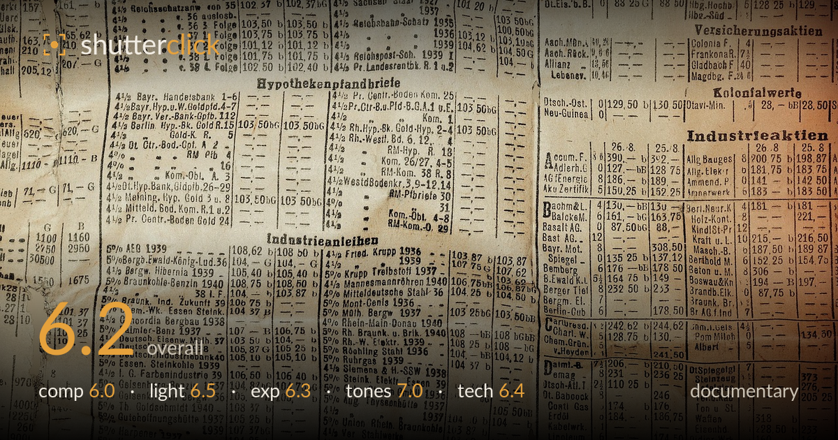
An old german stock listing
Photo by Pezibear

No EXIF metadata in this file
Technical analysis based on visual assessment only.
This is a flat-lay copy of an aged German stock listing — likely from the late 1930s given the dated entries — and its documentary value rests on legibility and the texture of decay. The warm, foxed paper and dense typographic grid carry genuine period atmosphere. What most holds it back is the framing: columns are clipped hard on all four edges with no margin or context, so the object reads as a fragment rather than a whole document. Uneven light across the sheet and a slight loss of sharpness at the corners further undercut the archival clarity this kind of subject demands. Strong texture, weak containment.
The frame is filled edge to edge with type, which suits a document study but leaves nothing to anchor the eye — every column competes equally and the crop severs entries on all four sides. There's no breathing room, no establishing margin, and no single element given emphasis. The faint fold lines and torn corner at lower left add welcome incident. Including the full page edge, or isolating one column as a deliberate focal band, would give the grid a structure to read against rather than an undifferentiated wall.
The light is soft and broadly even, appropriate for flat copy work, but it falls off noticeably toward the right side, where the sheet warms and darkens into a deeper amber. That gradient reads as an uneven source rather than an intentional mood, and it makes the right-hand columns harder to parse than the left. For a document whose worth is legibility, flat, fully even diffused light across the whole surface would serve better. The gentle raking does, however, bring out the paper's undulation and creases.
Exposure is generally well judged for aged paper — highlights on the lighter left portion hold without blowing, and the type stays readable through most of the frame. The right side drifts darker and the deepest amber areas begin to lose the finer print into muddy shadow. Midtones sit comfortably and the overall brightness respects the sepia tonality rather than forcing it neutral. Lifting the shadow end slightly, or evening the source, would recover legibility in the warmest corner without flattening the character.
The tonal palette is the strongest element: warm sepia and foxed browns give an authentic, archival richness, and the gradation from cream on the left to deep amber on the right, while a lighting issue, reads pleasantly as patina. White balance is left honestly warm rather than corrected to a clinical grey, which suits the subject. Contrast is moderate and keeps the fine print separated from the paper. The consistency of the aged-paper hue across creases and stains holds the image together tonally.
Focus is reasonably sharp across the central sheet, and the fine typographic detail resolves well enough to read most entries — a real achievement given the density of the text. Sharpness softens toward the corners, which on a flat subject points to either a slight plane misalignment between sensor and paper or edge softness in the lens; keeping the camera precisely parallel to the document would sharpen the extremes. No obvious motion blur or noise intrudes, and the depth of field appears sufficient to hold the whole plane, suggesting a sensible working aperture. For copy work of this kind, the key technical goals are a perfectly parallel sensor, even illumination, and edge-to-edge sharpness; this delivers on the first partially and the last partially. A tighter, squared-on capture with the full page edges included would let the document be read as an artifact and archived faithfully, which is the point of a documentary copy.
What would elevate it
Tags
Shot something like this?
Expert photo critique, on demand — scored across six categories, EXIF-aware. Start with 3 free critiques, no credit card.
critique my photo — free