Ancient stupa under cloudy skies
Photo by Nabin K. Sapkota

No EXIF metadata in this file
Technical analysis based on visual assessment only.
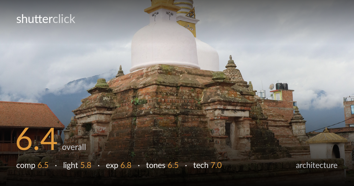
A solid, clear documentation of a Newari stupa, with the brick base placed at a three-quarter angle that gives the structure dimensionality and a sense of weathered age. The golden and white spires read clearly against a soft sky. What most holds the image back is flat, overcast light that drains modelling from the brickwork and gives the whole frame a low-contrast, slightly muddy feel. The foreground cobblestones occupy considerable space without adding much, and the slightly low vantage cuts the spires close to the top edge. The structure is well captured but the conditions limit its impact.
The three-quarter angle on the stupa base is the right call, presenting two faces and conveying mass and depth. The corner of the plinth anchors the lower frame and leads the eye up the structure. However, the foreground cobblestone apron is large and undifferentiated, eating roughly a third of the frame without reward, while the spire tips sit uncomfortably close to the top edge. The cluttered modern buildings on the right compete with the historic subject. A slightly higher viewpoint or a step back would have balanced the vertical proportions better.
Heavy overcast delivers flat, directionless light that suppresses the texture of the aged brickwork — the very surface that gives this monument its character. Without raking side light the carved cornices and moss-laden courses lose their relief and read as a uniform mass. The soft light does flatter the white dome and prevents blown highlights on the gold, but the trade-off is a lack of depth and sculptural emphasis. Early or late side light would have transformed the masonry's reading.
Exposure is handled competently for difficult conditions. The bright overcast sky retains some cloud structure rather than clipping to white, and the gold and white spires hold detail without glare. Shadow areas in the recesses of the brick base keep information. The overall balance leans slightly bright, which mildly washes the upper sky, but nothing is critically lost. The histogram appears well within range, with deliberate handling of the wide tonal spread between dark brick and pale sky.
The terracotta and ochre brick tones are pleasant and the white dome stays neutral, suggesting accurate white balance. But the flat light produces a low-contrast palette that feels slightly muddy across the masonry, and the grey-blue sky is dull and lifeless. The greens of the grass read a touch desaturated. A gentle contrast lift and selective clarity on the brick would restore some bite. The gold spire is the strongest tonal accent and pulls the eye effectively.
Focus is accurately placed on the stupa, with the brick courses rendered crisply and adequate depth of field carrying both the near plinth corner and the spires into acceptable sharpness — consistent with a moderately stopped-down aperture suited to architecture. The verticals of the spires sit reasonably true, with only minor lean, and there's no gross keystoning, suggesting a sensibly level camera position and a focal length that avoids heavy distortion. Noise is well controlled in the flat light. The main technical limitation is not the capture but the conditions: the soft light gives the lens little to resolve in the way of texture contrast. A polariser would have done little under full overcast, but careful sharpening in post would recover micro-detail in the masonry. Overall the execution is clean and the subject well served by the technical choices; the frame could have benefited from a marginally higher vantage to keep the spires clear of the top edge.
What would elevate it
Tags
Shot something like this?
Expert photo critique, on demand — scored across six categories, EXIF-aware. Start with 3 free critiques, no credit card.
critique my photo — free