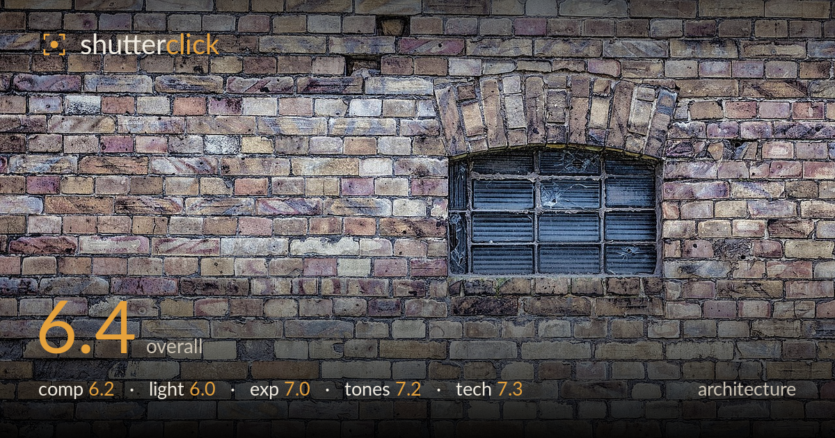
Arched window in a brick wall
Photo by Nikiko

No EXIF metadata in this file
Technical analysis based on visual assessment only.
A study in texture and pattern, with the single arched window providing the one break in an otherwise relentless field of weathered brick. The wall itself is the strongest element — varied colour, mortar detail, and the brick arch above the window all reward close looking. What holds it back is the window's placement in the upper-right quadrant, which leaves the lower half feeling like filler rather than deliberate negative space. A more decisive relationship between subject and frame, and a raking light to lift the brick relief, would sharpen the intent from documentation toward composition.
The window sits in the upper-right third, a defensible placement, but the frame carries far more brick below it than the composition needs, so the lower half reads as dead weight rather than intentional negative space. The frontal, flat-on approach suits the texture study and keeps verticals honest. Cropping down or shifting to give the window a clearer anchoring relationship to an edge would tighten the balance. The brick arch is a genuine asset — bringing it more centrally into play would give the eye a stronger path.
Flat, diffuse light — likely overcast — renders the brick evenly and holds detail across the whole wall, but it also flattens the very surface relief that makes brick worth photographing. The mortar lines and the individual brick faces stay legible, yet nothing pops in three dimensions. A low, raking side light would carve shadow into every joint and turn the texture from described into felt. As shot, the illumination is serviceable and even but does little to dramatise the subject.
Exposure is well controlled and even across a wide, detail-rich surface. Highlights on the pale bricks hold without clipping, and shadow areas in the mortar and the recessed window retain information. The window glass sits appropriately dark against the warm wall without blocking up entirely. The histogram would show a healthy midtone-weighted spread with no alarming spikes. This is a competent, deliberate reading of an evenly lit scene, and the tonal separation between bricks survives intact.
The muted palette — dusty ochres, lilacs, and grey-blues threaded through the brick — is the image's quiet strength, and it reads as authentic rather than pushed. White balance is neutral, letting the cool window glass contrast the warm masonry. Contrast is moderate and suits the flat light. There is real variety in the brick colour that rewards attention. A touch more local contrast or clarity in the brick faces would deepen the material feel without tipping into an over-processed look.
Focus is accurate across the wall plane, which is exactly what a frontal texture study demands, and the frontal alignment keeps verticals and horizontals largely square with no obvious keystoning — a discipline this subject rewards. Depth of field is clearly sufficient given the single flat plane; a small-to-moderate aperture would have been the right call and the evidence supports edge-to-edge sharpness. Noise is not a concern in this even light. The image resolves fine brick and mortar detail cleanly, suggesting a steady platform and a lens performing well across the frame. The main technical opportunity is not in capture settings but in intent: the flat plane is executed faithfully, yet the shot does not exploit any technique — shallow focus, perspective, selective light — to elevate documentation into interpretation. As a clean, sharp record of a textured surface with a single architectural accent, the execution is sound and the sharpness dependable.
What would elevate it
Tags
Shot something like this?
Expert photo critique, on demand — scored across six categories, EXIF-aware. Start with 3 free critiques, no credit card.
critique my photo — free