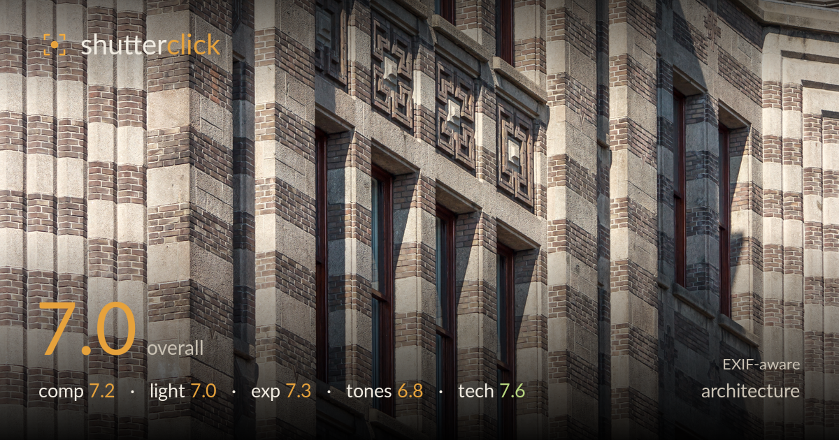
Art deco brick corner in raking light
Photo by Slaunger

| Focal length | 84 mm |
| Aperture | f / 5.6 |
| Shutter | 1/400 s |
| ISO | ISO 100 |
| Exp. comp. | 0.0 EV |
| Shot at | 14:01 · Sep 13, 2016 |
A confident study of Art Deco brickwork that reads as much as texture and pattern as architecture. The corner of the building splits the frame into two receding planes, and the repeating geometric relief panels give the eye a clear rhythm. What holds it back is a slight ambiguity of purpose: the crop is neither a full detail study locked to the ornament nor a wider structural statement, so the strong diagonal corner competes with the flat pattern rather than reinforcing it. Light does good work carving the relief. Cleaner tonal separation and a more decisive framing of the corner would sharpen the intent.
The corner divides the frame into two facades at different angles, creating depth and a strong vertical spine down the centre. The stacked relief panels and window bays give repeating rhythm that rewards the tight crop. However, the split placement leaves the left plane as flat pattern and the right as receding perspective, so the two halves pull against each other rather than working as one. Anchoring the corner slightly off-centre, or committing fully to one plane's ornament, would resolve the tension and give the geometry a clearer focal hierarchy.
Directional sunlight rakes across the facade from the right, and that low-ish angle is doing the important work — carving shadow into the recessed brick coursing and the geometric relief so the ornament reads three-dimensionally. The cast shadow of a projecting element on the right adds welcome variation. The light is fairly hard, which suits the crisp masonry but flattens slightly on the shaded left plane, where detail sinks into uniform grey. A moment with the sun a touch lower would deepen the raking effect and lift the texture further across the whole surface.
Exposure is well controlled for a high-contrast masonry subject in direct sun. Highlights on the pale stone hold texture without clipping, and the darker brick and window recesses retain detail rather than blocking up. The histogram sits comfortably in the midtones with no accidental crush. The shaded left facade is the weakest zone, sitting a little flat and murky, but that is a light-direction issue more than a metering error. Overall the ISO 100 base and 0.0 EV choice keep the tonal range intact and deliberate.
The palette is muted and earthy — grey stone, brown and buff brick — which honestly reflects the material but leans slightly dull. White balance is neutral to marginally cool, which mutes the warmth the raking sun should bring to the brick. Contrast is moderate; the pattern would gain punch from a little more separation between the pale coursing and the darker relief. There is a faint flatness across the shadowed plane that a touch more local contrast would resolve. The tonal range is honest but currently underplays the surface's richness.
The settings are well matched to the subject. At 84mm on the EF-S 55-250, f/5.6 keeps the entire flat facade acceptably sharp — depth of field is not a concern for a near-planar wall, and the aperture sits at the lens's usable range without pushing into diffraction. 1/400s is far more than needed for a static building handheld, so there is no motion blur and IS had an easy job; ISO 100 delivers a clean, noise-free file with full tonal latitude. Focus appears accurately placed on the brickwork, and detail resolution across the coursing and relief panels is genuinely good for this consumer telephoto. The main technical observation is perspective: shooting up and across the corner at a telephoto length introduces converging verticals and keystoning that, for architecture, would ideally be corrected — either with a tilt-shift approach or in post. A modest perspective correction in editing would straighten the leaning planes without costing much of the frame.
What would elevate it
Tags
Shot something like this?
Expert photo critique, on demand — scored across six categories, EXIF-aware. Start with 3 free critiques, no credit card.
critique my photo — free