Autumn entrance with pumpkins on the steps
Photo by Friedrich Haag

No EXIF metadata in this file
Technical analysis based on visual assessment only.
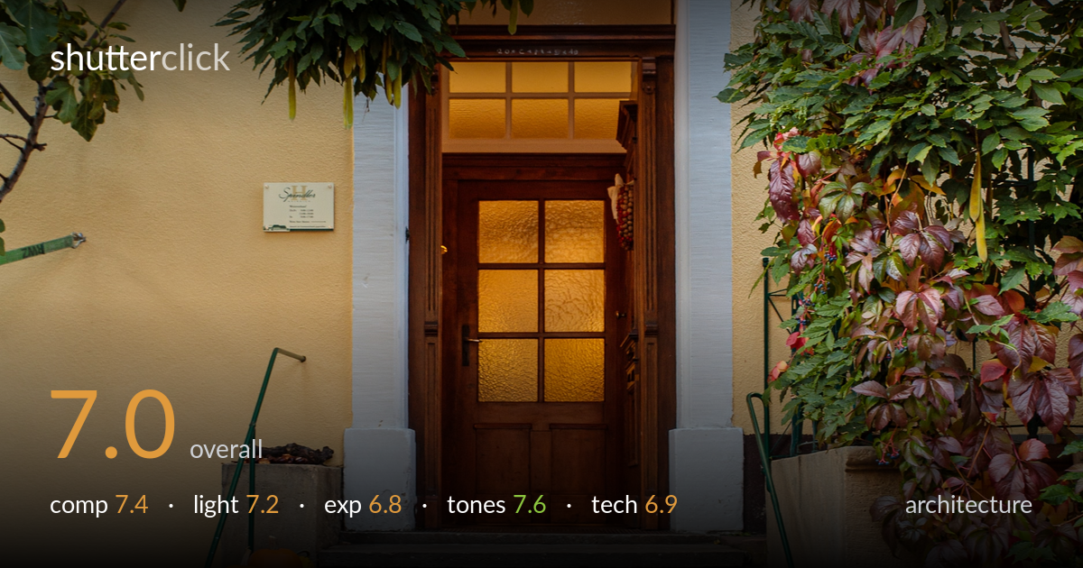
A warm, inviting entrance scene that uses the framing foliage and the staircase as a natural lead to the glowing doorway. The autumn palette — orange pumpkins, reddening vine, yellow wall — carries the image and makes it feel seasonal and lived-in. What most holds it back is verticality: the door and door frame lean noticeably off-plumb, which an architecture viewer reads immediately. The framing greenery, while atmospheric, crowds the top and creates a heavy, slightly cluttered cap over the composition. Tightening the verticals and giving the doorway a touch more breathing room would lift it from a pleasant travel snap toward a controlled architectural study.
The staircase is a strong central lead, carrying the eye straight to the warmly lit door, and the pumpkins anchor the lower-left frame nicely. The overhanging foliage frames the entrance but presses down heavily across the top, making the upper third busy and slightly oppressive. The door sits centred, which suits the symmetry of an entrance, yet the surrounding elements aren't balanced — the left wall is plain while the right brims with vine. A fraction more sky or wall above the foliage, and slightly less dead cobblestone at the bottom, would settle the proportions.
Soft, diffuse daylight — likely overcast or open shade — keeps the foliage and stonework evenly rendered with no harsh shadows, which flatters the warm palette. The real lighting accent is the interior glow spilling through the door glass, drawing the eye to the destination and giving the scene depth and warmth. The trade-off is that the diffuse outdoor light is a little flat, lacking the directional rake that would model the stone steps and stucco texture. A lower-angle, warmer light near golden hour would add dimensionality.
Overall a balanced exposure that retains detail across the bright yellow wall and the shadowed greenery. The lit doorway and door glass approach the brightest values without fully clipping, holding the warm glow. The deepest foliage shadows on the right block up somewhat, losing separation among the vine leaves. The cobblestone foreground and steps sit comfortably in the midtones. Slightly lifting the shadows would recover detail in the darker vine and the lower-right corner without flattening the mood.
The autumnal colour story is the photo's greatest strength — the orange pumpkins, reddening Virginia creeper, yellow stucco and warm wood door form a cohesive, seasonal harmony. White balance leans pleasantly warm, supporting the inviting mood, though it edges slightly toward yellow in the wall. Contrast is gentle and appropriate for the soft light. The green and red of the foliage are saturated but not garish. A touch of cooling in the wall highlights would prevent the yellow from dominating the neutral whites of the door frame.
Focus appears accurate across the central plane, with the steps, door and pumpkins all rendered sharply, and depth of field is deep enough to keep both foreground and entrance acceptably crisp — sensible for an architectural scene. Noise is well controlled, suggesting a low ISO and good light. The most significant technical issue is perspective: the door, door frame and white pilasters all lean inward, indicating the camera wasn't level or the lens distortion wasn't corrected. For architecture this is the priority fix — a perspective-correction adjustment in post, or a more square-on shooting position, would straighten the verticals. The framing foliage is slightly soft at the edges, partly from being closer to the lens than the focal plane, which is acceptable as a vignette but reinforces the cluttered top. A modest crop and a careful transform pass would tighten the execution considerably.
what would elevate it
tags
Shot something like this?
Expert photo critique, on demand — scored across six categories, EXIF-aware. Start with 3 free critiques, no credit card.
critique my photo — free