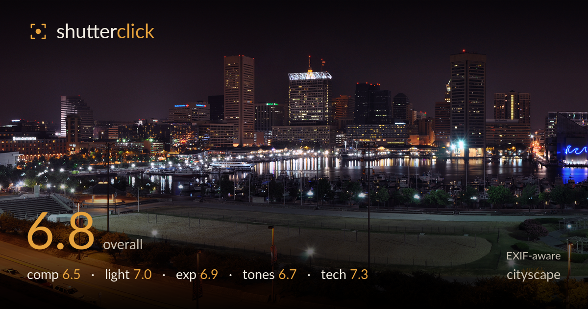
Baltimore skyline across the harbour at night
Photo by Joe Ravi

| Focal length | 24 mm |
| Aperture | f / 11.0 |
| Shutter | 4.0 s |
| ISO | ISO 200 |
| Exp. comp. | 0.0 EV |
| Shot at | 22:42 · Jul 3, 2011 |
A wide panoramic sweep of the Baltimore skyline and Inner Harbor that captures the scale of the waterfront well, but the extreme aspect ratio dilutes the impact by giving equal weight to a lot of dark, empty foreground. The skyline itself — layered, reflective, punctuated by the blue-lit pavilion — is the strongest element, yet it occupies a thin band across the middle. The stitched frame holds together cleanly with no obvious seams, and the exposure balances artificial light sources without severe clipping. The biggest gains lie in tighter framing and pushing the harbour reflections harder to anchor the composition.
The panoramic stitch delivers genuine breadth, and the skyline reflections in the harbour form a natural midline. But the foreground — dark lawns, a beach volleyball court, roadway — consumes nearly half the frame while offering little interest, and the bright orange sodium-lit road at bottom pulls the eye down and away from the skyline. The horizon and skyline sit slightly low in the tall band of empty sky above. A crop that trims sky and foreground would concentrate attention on the layered waterfront and its reflections, where the real content lives.
The mix of light sources is handled with care for a night cityscape — cool office windows, warm sodium streetlights, and the striking blue pavilion glow all read distinctly. The harbour surface catches enough reflected light to layer the scene. The foreground lawn and volleyball court, however, fall into flat, evenly lit dead zones from overhead park lamps, contributing little mood. The skyline is where the light does its work; the lower third would benefit from either darker shadow or a more selective inclusion of light sources.
The four-second exposure at f/11 and ISO 200 is a sound choice, holding highlight detail in most window lights and building faces without blowing them out. The blue pavilion and brighter street lamps show mild bloom but nothing objectionable. Shadow areas in the foreground retain some detail without lifting to noise. The overall balance leans slightly dark, which suits the night mood, though the orange road strip at the bottom edge is the brightest, most saturated region and competes with the intended subject. Overall a controlled, deliberate exposure.
The colour palette is the honest mix of a modern night skyline — warm sodium orange dominates the foreground while cooler whites and the blue pavilion lift the midground. White balance sits on the warm side, which the sodium lighting drives naturally, though it makes the lower road feel heavy and orange. Contrast is reasonable, with deep blacks in the sky and clean separation between lit structures. Pulling back some of the orange saturation in the roadway and warming the skyline slightly less would give a more balanced, refined tonal spread.
The settings are well matched to the task: f/11 secures front-to-back sharpness across a deep scene, ISO 200 keeps noise minimal, and the four-second exposure gathers ample light while smoothing the harbour water. At 24mm on a DX body the field of view is moderate, and stitching multiple frames into this panorama was the right approach to gain width without a wider, more distortion-prone lens. The stitch is clean — no visible ghosting or misalignment across the skyline. Focus holds well through the buildings. The main technical caveat is that the tripod stability and long exposure could have been pushed further; a longer shutter would have rendered the water glassier and drawn out more light-trail interest from moving traffic on the roads. There is also faint softness in the far-right buildings, likely a slight focus or stitch edge effect. Overall the execution is technically competent and the fundamentals are solid.
What would elevate it
Tags
Shot something like this?
Expert photo critique, on demand — scored across six categories, EXIF-aware. Start with 3 free critiques, no credit card.
critique my photo — free