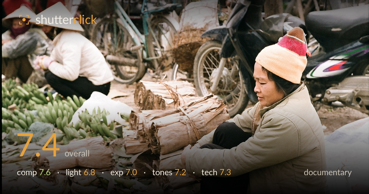
Banana vendor at the market
Photo by tayphuong388

No EXIF metadata in this file
Technical analysis based on visual assessment only.
A quiet, well-observed market scene that reads as authentic documentary work. The seated vendor anchors the right third with a natural downward gaze, and the foreground bananas build a layered sense of place, while the second worker in the conical hat adds narrative depth. What most holds the frame back is the busy upper zone — the bicycles and motorbike compete for attention without resolving into clean shapes, and the overcast light keeps the whole scene a touch flat. The moment is genuine and the storytelling strong; tightening the background relationship would lift it further.
The vendor sits comfortably on the right third with her gaze leading back into the frame, and the diagonal run of bundled leaves and banana stacks pulls the eye through the scene. The layering — foreground produce, mid-ground goods, seated figures behind — builds real depth. The weakness is the top third: overlapping bicycle wheels and the motorbike form a cluttered band that never resolves into a clear shape and competes with the human subjects. A slightly lower angle or tighter frame would calm that congestion.
Flat, overcast light typical of a market morning. It's even and free of harsh shadow, which suits the reportage honesty and keeps skin tones and the pale jacket readable, but it does little to model form — the scene stays somewhat two-dimensional and the produce lacks the sheen that raking light would give. The soft light does render the vendor's face gently without squint or hotspots. A break in the cloud or a lower sun angle would have added the directional shaping this frame is missing.
Exposure is well controlled for a mixed scene. The pale jacket holds highlight detail without clipping, and shadow areas in the dark trousers and motorbike retain structure rather than blocking to black. Midtones sit comfortably, keeping the face and the greens of the bananas legible. The overall level errs slightly bright in the upper-left figures, where the white padding edges toward washed-out, but nothing critical is lost. A deliberate, balanced exposure that handles the wide brightness range of the scene competently.
The palette is muted and earthy — tan cardboard bundles, olive-green bananas, the beige jacket — unified by cool, slightly grey overcast white balance that reads honest to the conditions. The warm pink-and-orange hat provides a welcome pop of colour that draws the eye to the subject. Contrast is on the gentle side, matching the soft light, and saturation is restrained and natural rather than pushed. A touch more midtone contrast would give the produce and textures more separation without breaking the documentary authenticity.
Focus lands accurately on the seated vendor, with her face, hat and jacket sharply rendered and fine detail visible in the fabric and the fibrous leaf bundles. Depth of field is moderate — enough to keep the foreground produce and background figures acceptably legible while gently softening the most distant clutter, which helps the seated subject stand forward. There's no obvious motion blur; the shutter clearly handled a static scene comfortably. Noise is well controlled, consistent with the flat daylight and colour-film rendering the image appears to have. The lens choice frames the scene at a natural working distance without distortion at the edges. The main technical limitation isn't execution but the background's visual density — the bicycles and motorbike are sharp enough to demand attention. A wider aperture to throw that band further out of focus, or repositioning to simplify it, would have used the depth of field more purposefully to isolate the human story.
What would elevate it
Tags
Shot something like this?
Expert photo critique, on demand — scored across six categories, EXIF-aware. Start with 3 free critiques, no credit card.
critique my photo — free