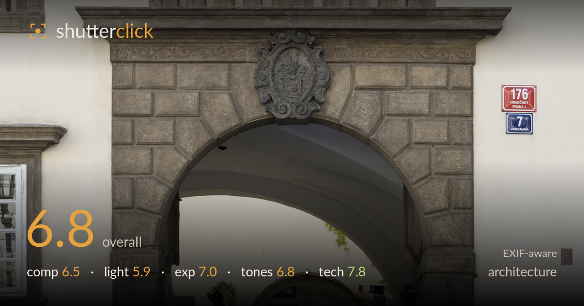
Baroque portal on loretánská street
Photo by Jacek Halicki

| Focal length | 25 mm |
| Aperture | f / 8.0 |
| Shutter | 1/250 s |
| ISO | ISO 200 |
| Exp. comp. | 0.0 EV |
| Shot at | 11:37 · Aug 23, 2015 |
A clean, documentary record of a Baroque portal in Prague's Hradčany district, with the carved stone archway, balustrade, and coat of arms rendered in solid detail. The straight-on framing and controlled verticals serve the architectural intent well. What most holds it back is the light: flat, high overcast that mutes the relief on the stonework and leaves the whole facade sitting in one tonal register. The archway interior also pulls attention to a cluttered gift-shop scene that competes with the formal geometry above. A stronger frame would either commit fully to the facade's symmetry or use raking light to bring the carving alive.
The symmetrical, front-on treatment suits the subject and keeps the verticals honest, framing the balustrade, portal, and windows as a coherent stack. The archway forms a natural centre, and the address plaques add context without dominating. The weakness is balance: the left crop clips neighbouring windows awkwardly while the right edge sits cleaner, so the facade isn't fully centred. The busy interior of the passage — souvenir racks, plants, a hanging shirt — draws the eye down into visual noise that undercuts the ordered stonework framing it.
Flat, diffuse overcast light dominates and does the stonework no favours. The rusticated blocks around the arch, the balusters, and the carved coat of arms all rely on directional light to read their depth and texture, and here that modelling is largely absent — the relief flattens into even grey. The one benefit is the soft, even illumination inside the passage, which keeps the interior legible without harsh shadow. But for architecture built on carved form, a low raking side light would transform how the ornament reads.
Exposure is well judged for a high-key facade. The pale plaster holds its value without blowing out, the window glass retains reflections, and the darker stone frame keeps detail in its shadows. The shaded passage interior is exposed enough to stay readable, a reasonable compromise given the bright exterior. Highlights on the upper wall sit close to the top of the range but appear controlled. Overall a balanced frame with no significant clipping and midtones placed sensibly across a tricky brightness range.
White balance is neutral and believable, with the cream plaster and grey sandstone reading true. Contrast is on the low side, partly a product of the flat light, leaving the facade slightly muted. The red address plaques provide the only real colour accent and they sit well. Tonal separation between the stone frame and surrounding plaster is adequate but could be pushed for more presence. A modest contrast lift in post would help the carved detail separate from its background without looking forced.
Settings are well chosen for the task. At 25mm the modest wide angle keeps perspective distortion in check, and f/8 is the right aperture for facade work — front-to-back sharpness across the stone, glass, and passage interior, comfortably inside the lens's sweet spot. ISO 200 keeps noise negligible and preserves tonal smoothness in the plaster. The 1/250s shutter is more than sufficient for a static building handheld. Focus lands accurately on the stonework, and detail in the balustrade and coat of arms is crisp. Verticals are close to true, suggesting either careful levelling or light correction — the frame doesn't show the keystoning a wide lens can introduce, which matters for architecture. The one limitation is not technical but timing-related: the gear executed cleanly, but no aperture or shutter choice can add the directional light the carved surfaces need. Solid, dependable capture that gives plenty of latitude in post.
What would elevate it
Tags
Shot something like this?
Expert photo critique, on demand — scored across six categories, EXIF-aware. Start with 3 free critiques, no credit card.
critique my photo — free