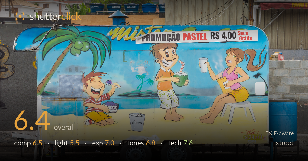
Beach mural on a food trailer
Photo by Wilfredor

| Focal length | 35 mm |
| Aperture | f / 7.1 |
| Shutter | 1/200 s |
| ISO | ISO 100 |
| Exp. comp. | 0.0 EV |
| Shot at | 05:36 · Mar 4, 2017 |
A cleanly documented piece of vernacular street painting — the hand-painted beach mural on the food trailer is the real subject, and it's captured square-on with good legibility. The flat, side-on framing reads as deliberate typological documentation, which is a valid street approach, but it also drains tension: there's no moment, no human presence, no gesture. The photograph succeeds as a record and less as a picture. What most holds it back is the overcast, directionless light that flattens the surface and mutes the mural's colours. Tighter attention to the busy top edge and the cut-off signage would lift it toward something more considered.
The square-on framing suits a typological record of the mural and keeps the painted figures legible across the panel. Balance is decent — the trailer fills the frame with the two wheels anchoring the base. But the top edge is cluttered and distracting: cropped water tanks, wires, and the abruptly cut 'mister' signage all compete without resolving. The blue drum on the right and the metal shelf on the left are dead weight. A touch more room below the wheels and a cleaner top would tighten the whole thing considerably.
Flat, overcast light does this subject few favours. The even illumination keeps the mural readable with no harsh shadows to obscure the paint, which is the one practical benefit, but it also robs the scene of any modelling or life. The surface reads as uniformly grey-lit, muting the tropical palette the mural is trying to sell. Directional light — a low sun raking across the panel — would add sheen, texture, and separation from the drab wall and cinderblock behind. As shot, the light is serviceable but inert.
Exposure is handled well for flat conditions. Highlights in the white promotional banner and the pale trailer base hold detail without clipping, and the shadow under the trailer and in the tyres retains information. Midtones sit at a sensible brightness, keeping the mural's blues and yellows legible. The histogram looks comfortably contained with the overcast light naturally compressing dynamic range. Nothing here reads as accidental — a straightforward, competent exposure that lets the subject speak, even if the scene offers little drama to expose for.
White balance is neutral and believable under overcast cloud — no colour cast fighting the painted scene. The mural's blues, yellows, and the pink top come through with reasonable saturation, though the flat light keeps everything a stop shy of vivid. Contrast is gentle and appropriate for the conditions. The surrounding greys — the wall, cinderblock, and asphalt — are honest but drab, and they slightly deaden the frame's overall energy. A modest saturation and contrast lift in post would let the mural's holiday palette do more of the talking.
Settings are well matched to the task. At f/7.1 the entire flat plane of the mural sits in sharp focus, which is exactly right for a subject with no depth to isolate — a wider aperture would have gained nothing here. Focus is accurate across the panel, with the painted linework and the promotional text crisp. ISO 100 keeps the file clean and noise-free, and 1/200 s is more than enough to freeze a static subject handheld, leaving no motion blur. The 35mm on the D300 (roughly 52mm equivalent) gives a natural, undistorted rendering of the flat surface without stretching the edges. Verticals are close to true, suggesting careful positioning. Nothing is technically wrong — execution is clean and deliberate throughout. The only lever left unused is that the scene demanded no technical risk, so the settings, while correct, aren't doing anything expressive. Solid, competent capture of a subject that asks little of the gear.
What would elevate it
Tags
Shot something like this?
Expert photo critique, on demand — scored across six categories, EXIF-aware. Start with 3 free critiques, no credit card.
critique my photo — free