Berlin cathedral at blue hour
Photo by Ansgar Koreng

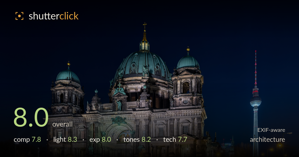
| Focal length | 15 mm |
| Aperture | f / 9.0 |
| ISO | ISO 640 |
| Shot at | 22:04 · Mar 16, 2016 |
A confident blue-hour rendering of the cathedral, with well-balanced illumination on the stone and a deep, clean night sky that gives the domes room to breathe. The TV tower on the right adds a valuable secondary anchor and a sense of place. What holds it back is the wide foreground of empty paving that eats the lower third without adding interest, and the verticals show mild outward lean from the 15mm perspective. The lit facade reads beautifully; a slightly higher vantage or perspective correction would sharpen the geometry that the subject deserves.
The cathedral sits solidly left of centre with the TV tower answering it on the right — a strong two-anchor balance that carries the eye across the frame. The verdigris domes stack against clean sky with generous headroom. The weakness is the lower third: a broad expanse of dark, featureless paving dominates the foreground without leading anywhere. Cropping some of that base, or finding foreground detail to occupy it, would tighten the frame. The street lamps on the right edge feel slightly incidental rather than integrated.
Blue-hour timing is judged well — the sky retains deep colour rather than going black, and the artificial floodlighting sculpts the stone facade with warm, even coverage that reveals column depth and statuary. The green domes catch enough light to hold their patina colour against the dark sky. Highlights on the lit windows stay controlled. The mixed street-lamp glow warms the base pleasantly. Direction and intensity of the floodlighting flatter the architecture without flat, frontal wash killing the relief.
A well-managed night exposure. The floodlit stone holds midtone detail without blowing the brightest lit areas, and the dark sky retains blue rather than crushing to pure black. Shadow areas in the recesses stay legible. A few point-source lights — the street lamps and the tower — clip, which is expected and acceptable at this scale. The overall balance between the bright facade and the surrounding darkness is handled with care, using the dynamic range effectively rather than letting the subject float in a black void.
White balance is well judged: the sky's deep blue plays against the warm sodium lamps and the cool verdigris of the domes for a satisfying complementary palette. Contrast is punchy without going harsh, and the stone retains natural warmth rather than tipping muddy. Saturation on the greens and blues is rich but believable. The tonal separation between the lit facade and the night sky is clean. Minor colour noise lurks in the darkest sky patches but does not intrude on the overall grade.
At 15mm, f/9, ISO 640, the choices are sound for a tripod-based night frame. The narrow-ish aperture keeps the full facade sharp front to back and lends the point lights a mild star quality. ISO 640 is a touch high for a static long-exposure subject — dropping to base ISO with a longer shutter would clean up the residual noise visible in the sky shadows. Focus lands accurately on the cathedral, with detail crisp across the columns and statuary. The 15mm wide angle captures the whole structure but at a cost: the extreme focal length introduces perspective distortion, with the towers leaning outward and the near-edge geometry stretched. Shooting from further back with a slightly longer lens, or applying perspective correction in post, would straighten the verticals this subject demands. The overall execution is clean and deliberate; the main technical refinements are lower ISO and disciplined verticals.
What would elevate it
Tags
Shot something like this?
Expert photo critique, on demand — scored across six categories, EXIF-aware. Start with 3 free critiques, no credit card.
critique my photo — free