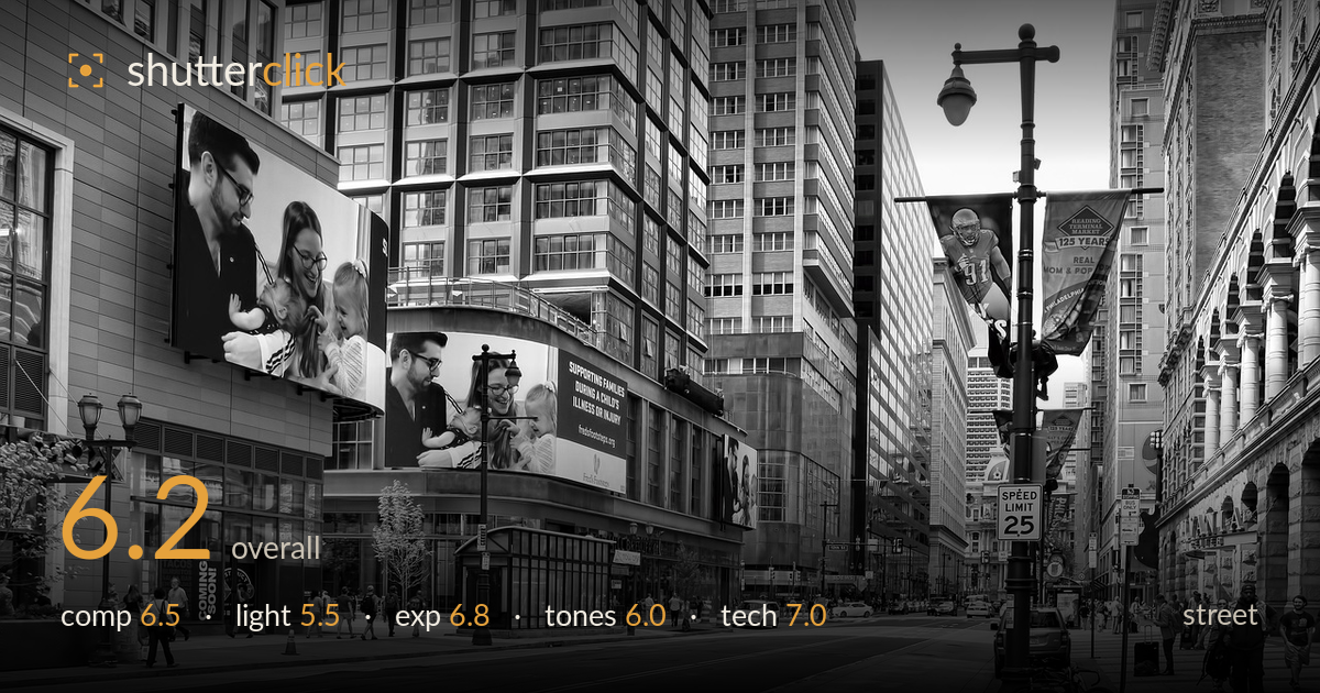
Billboards over a downtown avenue
Photo by BruceEmmerling

No EXIF metadata in this file
Technical analysis based on visual assessment only.
A well-observed urban scene that captures the vertical energy of a downtown corridor, with the large family billboards giving the frame an unexpected human presence that plays against the anonymous street below. The lamppost on the right anchors the composition and the receding building lines pull the eye down the avenue. What holds it back is the absence of a decisive human moment — this reads more as a street scene than street photography. The flat overcast light also mutes the black-and-white conversion, leaving mid-tones grey and separation weak. A stronger foreground subject and punchier grading would elevate it considerably.
The frame uses the street canyon well, with converging building lines and the lamppost providing a strong right-hand anchor. The billboards balance the mass on the left. However, the composition lacks a clear primary subject — the eye wanders between billboards, lamppost, and distant traffic without settling. The foreground road occupies a large, empty lower third that adds little. Placing a pedestrian or gesture in the near ground would give the wide scene a focal point and a sense of scale it currently lacks.
Flat, diffuse overcast light dominates, which flattens the building facades and offers little directional shaping. The billboards, being internally lit graphics, read well, but the architecture loses dimensionality without side light or shadow play. This kind of even light suits detail retention but works against the drama a tall street canyon can offer. Shooting the same view at golden hour, or when raking sun catches one row of facades, would carve out the depth and separation the scene is missing.
Exposure is handled competently for a high-contrast urban scene. The bright overcast sky is held just under clipping, and shadow detail survives in the recessed shopfronts and under the lamppost. Midtones sit a touch grey overall, which reads as a slightly conservative exposure rather than an error. There is no significant blown highlight or crushed black. A small lift to the whites and deepening of the darkest shadows would give the histogram more range and stop the frame feeling tonally compressed.
The black-and-white conversion is clean but lacks bite. Mid-tones cluster in a narrow grey band, leaving buildings, road, and sky feeling similar in weight and the image reading soft. Shadow depth is modest and highlights roll off gently rather than snapping. For a dense architectural street scene, a stronger contrast curve — deeper blacks under the canopies, brighter whites on the sunlit facades — would add the structure the grade currently lacks. The tonal separation between the billboards and their surroundings is the strongest element.
Sharpness is good across the frame, with the lamppost, signage, and building detail all crisply rendered, suggesting a well-chosen aperture for deep depth of field appropriate to this kind of wide street view. There is no visible motion blur despite the moving traffic, indicating an adequate shutter speed, and noise is well controlled throughout the shadows. The verticals are largely upright, with only minor convergence in the tall buildings — respectable for a handheld street frame and easily corrected. Focus appears to sit on the mid-distance, which serves the scene well given the broad subject matter. The main technical limitation is not capture but the lack of a defining focal element to reward that sharpness. Everything is rendered cleanly, yet nothing is prioritised. A slightly longer focal length or a step closer to isolate one storefront or figure would have directed the excellent detail resolution toward a clearer purpose.
What would elevate it
Tags
Shot something like this?
Expert photo critique, on demand — scored across six categories, EXIF-aware. Start with 3 free critiques, no credit card.
critique my photo — free