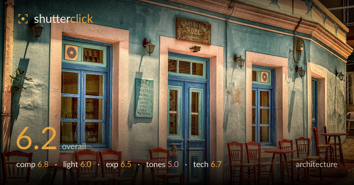
Blue and terracotta greek cafe
Photo by analogicus

No EXIF metadata in this file
Technical analysis based on visual assessment only.
A charming Greek café facade with strong colour contrast between blue woodwork and terracotta paving, but heavy HDR processing is the dominant issue. The tone-mapping flattens local contrast, introduces haloing around the roofline and wires, and pushes saturation into an artificial, almost painterly register that undercuts the authenticity of the scene. Composition works reasonably well — the repeating rhythm of blue windows and red chairs leads the eye across the frame — though the arrangement is busy and lacks a single anchor. Dialling back the HDR and reclaiming natural tonality would let the genuine charm of this subject speak far more convincingly.
The frontal, slightly angled view captures the repeating rhythm of blue-framed openings and clustered red chairs, giving the frame a pleasant lateral flow. The diagonal of the paving in the lower right adds depth and pulls the eye into the scene. However, the composition is cluttered — the tables and chairs compete for attention with no clear focal anchor, and the central blue door, the natural hero, sits partly obscured. A cleaner foreground or a stronger emphasis on that door would give the eye somewhere to rest.
The light appears to be warm, low-angle sun raking across the facade, casting the lamp shadows and warming the paving — a good time of day for this subject. But the HDR processing has largely erased the directional quality of that light, lifting shadows so aggressively that the modelling on the wall and the sense of a single light source is lost. The result reads flat and evenly lit despite the raking shadows still visible on the pillar at left. Preserving that shadow gradient would restore dimensionality.
Exposure is broadly balanced with no severe clipping — highlights on the pink door surround and shadow areas under the chairs both retain detail, which is the intended strength of the HDR approach. The trade-off is that the tonal compression leaves the image without true blacks or clean whites, so it lacks punch. The midtones are pushed up uniformly, flattening the histogram into a narrow band. A touch of restored contrast at the extremes would give the frame the depth its current even exposure sacrifices.
This is where the image struggles most. The colour is heavily oversaturated and the tone-mapping gives the surfaces an artificial, almost illustrated quality — the terracotta paving glows unnaturally and the blues verge on cartoonish. White balance leans warm throughout, which suits the setting but compounds the saturation. Fine haloing around the roofline, wires and window edges betrays the aggressive local-contrast processing. Pulling saturation back substantially and easing the HDR would recover a more believable, and ultimately more attractive, palette.
Focus and sharpness are handled well across the plane of the facade, with the frontal geometry keeping most of the scene within acceptable depth of field, and the framing suggests a considered viewpoint. Verticals are reasonably controlled — the window and door frames stay largely upright without obvious keystoning, which is appropriate for the architecture genre. The dominant technical concern is post-processing rather than capture: the HDR tone-mapping introduces visible halos along high-contrast edges such as the roofline, the overhead wiring and the window surrounds, and it flattens micro-contrast so that textures on the plaster and paving read as slightly plasticky. Noise is not a problem here. The execution at the point of capture appears sound — a stable position, good detail retention, and a well-chosen angle — so the improvements lie almost entirely in restraint during editing. A gentler tone curve and reduced local-contrast strength would preserve the technical merits of the original file while removing the tell-tale artefacts.
What would elevate it
Tags
Shot something like this?
Expert photo critique, on demand — scored across six categories, EXIF-aware. Start with 3 free critiques, no credit card.
critique my photo — free