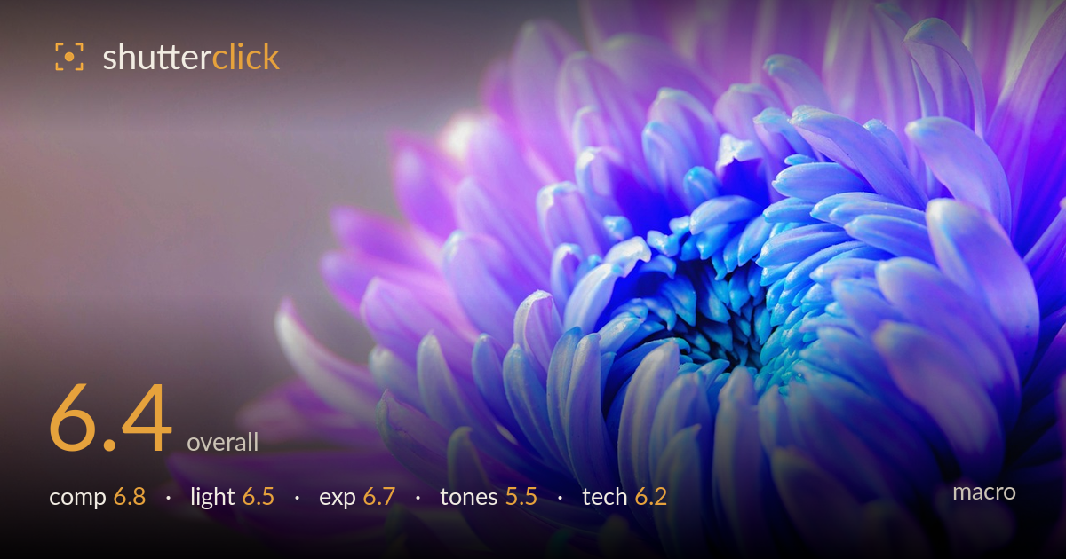
Blue and violet chrysanthemum close up
Photo by cocoparisienne

No EXIF metadata in this file
Technical analysis based on visual assessment only.
A clean macro of a chrysanthemum with the bloom pushed to the right and generous negative space at left — a workable diagonal arrangement with breathing room. What most holds it back is the colour. The blue-to-violet gradient across the petals looks graded well past natural, tipping into an artificial, screensaver register that undercuts credibility. Focus sits on the outer petals rather than driving fully into the centre spiral, so the most compelling detail — the tight core — is soft. A more honest white balance and a focus plane placed on the flower's heart would lift this from decorative to genuinely arresting.
The bloom anchored in the right two-thirds with the swept negative space at left is a sound choice, and the spiral of petals creates a natural curve that pulls the eye toward the core. The diagonal energy from lower-left to upper-right works. The centre of the flower, the strongest element, sits a touch too far into the corner, crowding the right and top edges where petals clip. Slightly more room around the core, or placing the spiral heart nearer a third intersection, would give the composition more resolve.
Soft, diffuse light wraps the petals evenly and avoids harsh specular hotspots, which suits the delicate subject and keeps the layered petals readable. The gentle falloff into the blurred background reads pleasantly. What's missing is directional shaping — the light is flat enough that the petals lack the raking definition that would separate each layer and bring out texture. A lower, more grazing side light would carve depth into the overlapping petals and give the centre spiral more three-dimensional presence.
Exposure is well controlled for a high-key subject. The pale background holds without blowing to pure white, and the brighter petal tips retain detail rather than clipping. Shadows in the recesses of the core stay open with information intact. The overall brightness suits the airy, delicate mood. The centre could carry a touch more midtone weight to anchor the frame — the whole image floats slightly light — but there is no accidental under- or over-exposure here, and the histogram appears deliberately placed toward the high end.
This is where the image struggles. The blue-to-magenta gradient reads as heavily graded rather than natural — chrysanthemums do not shift like this, and the saturation in the blue core is pushed to a synthetic intensity. The transition is smooth and the palette is cohesive, so the intent is clear, but it lands in artificial territory that undercuts the subject's realism. Pulling back saturation, especially in the blues, and easing the hue toward a believable violet would keep the mood while restoring credibility and tonal subtlety.
Depth of field is shallow, appropriate for macro, and the background dissolves cleanly with no distracting artefacts. The problem is where the focus plane lands: sharpness sits on the mid and outer petals on the right, while the centre spiral — the natural focal point and the most detailed region — drifts soft. In macro, the eye expects the tightest resolution at the core, and that isn't delivered here. Some petal edges show pleasing crispness, so the lens is capable; this is a plane-placement issue. Focus stacking would resolve the shallow-DOF limitation entirely, holding the core spiral and outer petals sharp together. Noise is well managed and there's no visible motion blur, so the capture was stable. Micro-contrast in the sharp regions is decent but the softer centre robs the image of its potential detail payoff. Nailing focus on the spiral heart, or stacking a few frames, would transform the technical impact.
What would elevate it
Tags
Shot something like this?
Expert photo critique, on demand — scored across six categories, EXIF-aware. Start with 3 free critiques, no credit card.
critique my photo — free