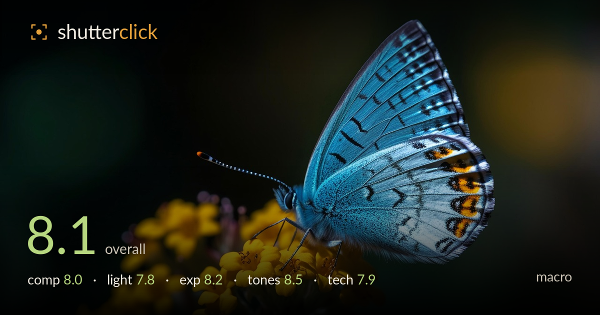
Blue butterfly on yellow blooms
Photo by nvd9612

No EXIF metadata in this file
Technical analysis based on visual assessment only.
A clean, high-impact macro built on a strong colour relationship — the electric blue wing against the yellow blooms and near-black background creates immediate graphic punch. The butterfly reads sharply where it counts, and the diagonal flower stalk gives the frame direction and support. What holds it back is the focus plane: the wing carries the detail while the head, eye, and antenna sit slightly soft, and the closer flowers lose crispness. The composition leaves generous empty space to the right that the subject doesn't quite balance. Tightening focus on the eye and reconsidering the negative space would push a good image toward excellent.
The diagonal flower stalk rising from lower left anchors the butterfly effectively and gives the frame movement. Placing the subject right of centre with the wing reaching toward the top edge works, and the dark negative space on the left isolates it cleanly. The weakness is the large empty area to the right of the wing — it isn't doing compositional work and leaves the balance slightly heavy on the subject side. A crop drawing the right edge inward, or the antenna given more room to breathe left, would firm up the framing.
Soft directional light rakes across the wing from the upper right, modelling the scaled texture and lifting the blue without blowing the highlights. The falloff into the dark background is handled well and does the isolating work a macro needs. The flowers catch a warmer, slightly harder glow that separates them from the shade. The head and near side of the body sit in flatter, dimmer light, which costs some of the definition around the eye and legs. A touch of fill or a shift in angle would carry detail more evenly across the subject.
Exposure is well judged for a high-contrast scene. The blue wing holds its brightest passes without clipping, and the yellow flowers retain petal detail despite their intensity. The near-black background is deep but not crushed into a total void, keeping a sense of dimension. Shadow areas on the underside of the butterfly stay readable. If anything, the darkest zones could be lifted a hair to recover faint background texture, but the current placement serves the graphic, isolated look and reads as a deliberate low-key treatment rather than accidental underexposure.
This is the image's strongest asset. The complementary blue-and-yellow pairing is vivid without tipping into oversaturation, and the orange spot-band on the wing edge adds a warm accent that ties the two hues together. White balance is neutral and believable, the greens in the background stay muted and unobtrusive, and contrast is pitched to make the subject leap forward. The tonal transition from the bright wing into the shadowed background is smooth. A marginal pull on the yellows' saturation would prevent them competing with the wing, but the grade is confident.
Sharpness on the wing is genuinely strong — the individual scales, veining, and the orange-and-black marginal spots resolve crisply, which is the hardest surface to nail. The problem is focus placement: the plane of sharpness sits on the wing rather than the head, so the eye, the base of the antenna, and the legs fall slightly soft. In macro the eye is the priority, and it isn't the sharpest point here. The shallow depth of field renders a beautifully creamy background and clean subject separation, but it also means the nearer flowers blur out; a slightly narrower aperture or a focus-stacked pair would carry both the eye and the wing. No visible motion blur, and noise is well controlled in the shadows. Overall execution is high, and the miss is one of focus targeting rather than capability — refining where the critical plane lands would resolve it.
What would elevate it
Tags
Shot something like this?
Expert photo critique, on demand — scored across six categories, EXIF-aware. Start with 3 free critiques, no credit card.
critique my photo — free