Blue hour at piccadilly circus
Photo by paulsteuber

No EXIF metadata in this file
Technical analysis based on visual assessment only.
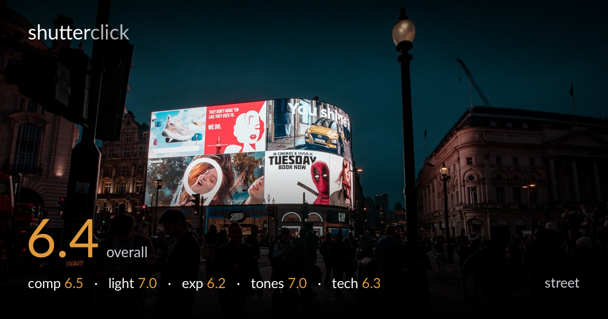
The glowing Piccadilly Circus billboards anchor a recognisable blue-hour scene with strong colour contrast against the deep sky, but the foreground crowd reads as an undifferentiated dark mass with no single figure carrying a moment. The image documents the place well yet lacks a decisive gesture or focal subject to elevate it beyond a postcard view. The lamppost on the right edge competes with the screens for attention without resolving into deliberate framing. The light and tonal mood are the strongest assets; the missing element is a human story in the foreground.
The curved billboard wall sits slightly left of centre and provides a bright, layered focal block against the dark sky, which works. The foreground pavement is generous and well-balanced, and the WAIT signal and lamppost add context. The problem is that the crowd has no anchor — figures are scattered and merge into shadow, so the eye drifts. The lamppost on the right edge feels half-committed: too prominent to ignore, not placed to frame. A clearer foreground subject or a moment among the people would give the composition purpose.
The blue-hour timing is judged well — enough ambient light remains in the sky to hold colour while the screens dominate as the key light source. The billboards throw warm and cool spill onto nearby figures and the wet-looking pavement, creating natural contrast and depth. Shadows on the foreground crowd are heavy, which suits the mood but swallows detail. The lamppost glow adds a secondary warm accent. Overall the light is the scene's strongest quality, balancing artificial and ambient sources convincingly.
Exposure favours the billboards, holding most of their colour and text legibly, which is the right priority since they are the visual draw. The trade-off is a foreground that falls deep into shadow, losing nearly all detail in clothing and faces of the crowd. The sky is clean and the bright screens show only minor clipping in the whites. This reads as a deliberate choice for mood rather than an error, but a touch more shadow lift would recover the people without compromising the screens.
The cool teal sky against the saturated reds, whites, and warm lamp glow gives a strong, coherent night-in-the-city palette. White balance holds the screens' colours believably while keeping the sky moody. Contrast is high, which serves the scene but crushes foreground midtones. The grade is consistent and pleasing, with the reds of the bus and billboards providing punchy accents. Mid-tone gradation in the darker pavement and crowd is where the image gives up the most information; a gentler curve there would help.
Sharpness on the billboards is good and the text is legible, suggesting a stable hold or short enough exposure to avoid blur despite the low light. The wide focal length captures the full sweep of the Circus and exaggerates the foreground space, which suits the documentary intent but also makes the scattered crowd feel small and incidental. Depth of field appears deep, keeping near and far in acceptable focus. Noise is controlled in the brighter areas but likely lurks in the heavy shadows, which is acceptable for the conditions. The main technical limitation is the shadow rendering of the foreground figures — they lack the detail and separation needed to function as subjects, and some appear slightly soft against the dark ground. A marginally higher exposure or a faster lens would have preserved more of that information. Focus is placed on the screens rather than any person, which reinforces that the scene, not a moment, was the priority.
what would elevate it
tags
Shot something like this?
Expert photo critique, on demand — scored across six categories, EXIF-aware. Start with 3 free critiques, no credit card.
critique my photo — free