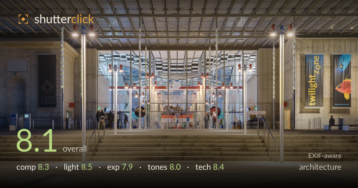
Blue hour at the academy entrance
Photo by King of Hearts

| Focal length | 35 mm |
| Aperture | f / 8.0 |
| Shutter | 2.0 s |
| ISO | ISO 100 |
| Exp. comp. | 0.0 EV |
| Shot at | 17:27 · Dec 1, 2016 |
A clean, well-disciplined blue-hour architectural frontal that reads the California Academy of Sciences entrance with authority. The symmetrical framing, level verticals, and balanced tungsten-versus-dusk colour interplay are the standout strengths — this is a considered, professional-grade capture. What holds it back most is the foreground: a large expanse of empty plaza and roadway occupies the lower third with little to reward it, and the deep-blue upper sky band pushes the roofline low. A slightly tighter vertical crop and a touch more shadow lift on the concrete piers would elevate an already strong architectural document.
The dead-centre frontal framing suits this symmetrical entrance, and the verticals are held true — the light poles, piers and glass mullions all read plumb. The staircase and railings draw the eye inward toward the lit interior, a natural focal core. The main weakness is proportion: the empty plaza and asphalt occupy roughly the lower third with little interest, while the pure-blue sky band compresses the roofline. Reducing the foreground and lifting the roof line higher in the frame would tighten the read considerably.
Blue hour is timed well — the deep cobalt sky still holds colour against the warm tungsten pooling under the canopy, and that contrast is the image's strongest asset. The uplit piers and downlit pole fixtures give layered, dimensional illumination that shapes the concrete without flattening it. The glowing interior anchors the frame as the brightest point, exactly where attention should land. The only quibble is the pole-mounted downlights create small hot pools on the plaza that draw the eye slightly downward, away from the entrance.
The two-second exposure balances the dim dusk sky against the bright interior competently, holding detail across a wide range. The interior glass and pole lights sit near clipping but retain just enough texture. Shadow detail in the concrete piers and the recessed left alcove goes fairly dense, losing some architectural form. The foreground plaza is well held. Overall a deliberate, controlled exposure for the conditions, though a bracketed blend would recover the darkest pier shadows and tame the brightest interior highlights.
White balance is handled with restraint — the warm interior and cool exterior sit in believable tension rather than fighting. The blue sky is saturated but not garish, and the concrete holds a neutral, natural grey. Contrast is moderate and appropriate for the mixed light. The main limitation is the transition zone where warm plaza light meets cooler shadow: it reads slightly muddy in the mid-tones. A touch more separation between the warm and cool zones would give the palette more snap without breaking the naturalism.
The settings are textbook for this shot. f/8 on the 35mm lands in the sharpness sweet spot and delivers front-to-back depth across the plaza, steps and entrance — appropriate for architecture where deep focus serves the subject. ISO 100 keeps the file clean with no visible noise in the shadow areas, which matters given the dense pier tones. The two-second shutter on a tripod is the right call at blue hour, and it renders the static structure crisply; the moving visitors near the entrance blur into ghosted forms, which reads acceptably here and even lends life without distraction. The 35mm focal length is a sensible middle ground that avoids the exaggerated perspective of wider glass while still taking in the full facade. Verticals are held true, suggesting careful levelling or corrected in post. Focus is accurate on the structural plane. Execution is disciplined throughout — this is competent, professional technical work with no significant errors.
What would elevate it
Tags
Shot something like this?
Expert photo critique, on demand — scored across six categories, EXIF-aware. Start with 3 free critiques, no credit card.
critique my photo — free