Blue hour at the round café
Photo by Ermell

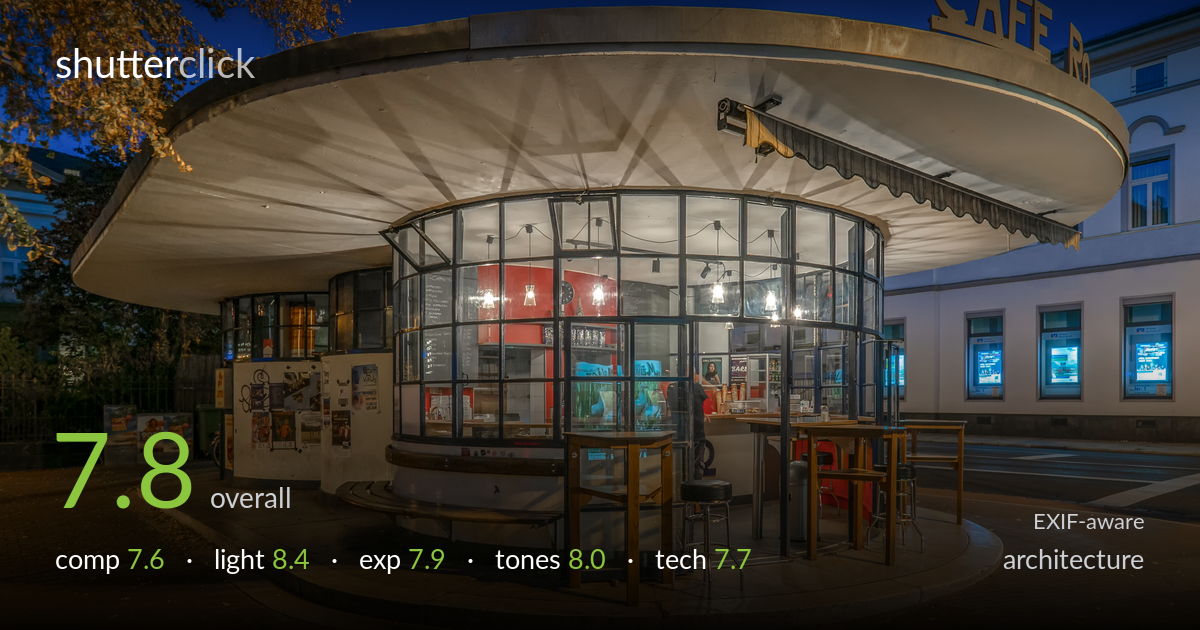
| Focal length | 9 mm |
| Aperture | f / 5.0 |
| Shutter | 1/2 s |
| ISO | ISO 200 |
| Exp. comp. | 0.0 EV |
| Shot at | 19:53 · Sep 20, 2018 |
A well-timed blue-hour capture of a striking circular modernist café, with the warm interior glow set cleanly against a deep cobalt sky. The disc roof reads as a strong central form and the wide lens emphasises its sweep. What most holds the shot back is the framing of the signage — "CAFE R" is clipped at the right edge, which feels accidental rather than deliberate and pulls attention. The 9mm wide angle also stretches the foreground paving, and verticals lean slightly outward at the frame edges. Light, colour, and timing are all working; the framing and edge discipline are where the gains lie.
The circular roof anchors the frame and the curving paving in the foreground leads the eye inward, giving real depth. The autumn branch at upper left adds a useful framing element against the sky. The weakness is the right edge: the "CAFE R" sign is cut mid-word, reading as an accident rather than a choice. The building behind competes for attention without contributing much. A slight shift to include the full sign, or a cleaner crop excluding it, would resolve the tension and let the disc form dominate.
Blue-hour timing is the photograph's strongest asset — the balance between the warm tungsten interior and the deep cobalt sky is held right at the moment the two read with near-equal weight. The glowing pendant lights and red interior wall give a focal warmth that draws the eye into the structure. The underside of the roof catches enough ambient and spill light to retain form rather than going black. Shadows on the paving are soft and even, and the overall mood is inviting without feeling artificial.
Exposure is well judged for the difficult dynamic range of blue hour. The interior highlights and pendant bulbs hold without serious clipping, and the deep sky retains colour rather than crushing to black. Foreground paving keeps detail in shadow areas, suggesting careful balancing — likely a single well-placed exposure rather than a heavy-handed blend. The brightest interior windows verge on hot but stay readable. A touch more shadow lift under the roof edge at left would even the read, but the midtone placement is largely sound.
The warm-cool colour contrast is the tonal signature here and it works: amber interior and paving against the saturated blue sky. White balance leans warm on the ground, which suits the mood but tips slightly orange in the foreground tiles. The sky saturation is strong without going synthetic. Contrast is handled gently so neither the bright interior nor the shadowed underside fights the frame. Pulling a little orange from the foreground paving would clean the palette and keep the warmth focused on the café itself.
The 9mm focal length on the E-M1 II suits the wraparound subject, capturing the full disc roof in a tight square. At f/5.0 the depth of field is ample for a near-far architectural scene, and front-to-back sharpness holds well. The 1/2s shutter at ISO 200 indicates a tripod, which keeps noise negligible and detail crisp — the right call for blue hour. Focus appears accurate across the structure. The trade-off of the ultra-wide is geometric distortion: the foreground paving stretches and verticals at the frame edges lean outward, which the architecture genre judges strictly. The building at right bows noticeably. A modest perspective correction in post would straighten these without much crop loss. The square aspect is a reasonable choice for the round subject, though it forces the sign clip. Overall the technical execution is clean and deliberate; the only real demerit is uncorrected wide-angle keystoning that a few minutes of lens correction would resolve.
what would elevate it
tags
Shot something like this?
Expert photo critique, on demand — scored across six categories, EXIF-aware. Start with 3 free critiques, no credit card.
critique my photo — free