Blue hour on a quiet lane
Photo by rmsep4

No EXIF metadata in this file
Technical analysis based on visual assessment only.
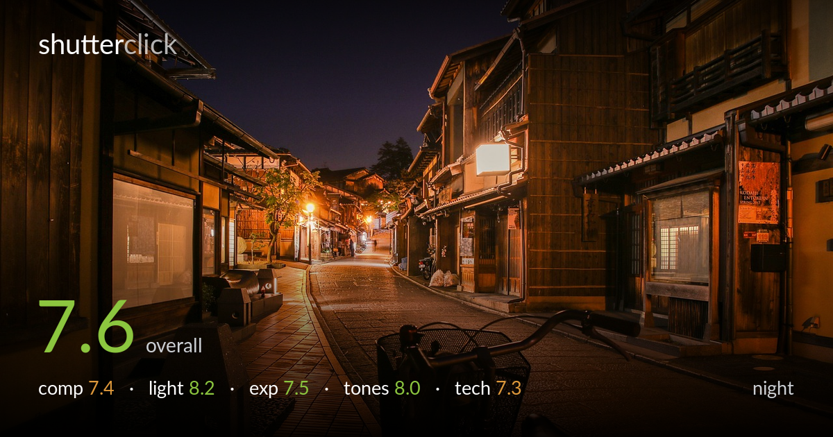
A clean, atmospheric blue-hour street scene where the warm interior glow plays against a deepening cobalt sky — the genre's signature tension handled well. The curving lane draws the eye through the frame and the wooden machiya lend a strong sense of place. What most holds it back is the silhouetted bicycle dominating the foreground: it's dark, slightly soft, and anchors the bottom of the frame without quite resolving as either a deliberate compositional device or a clean lead-in. Tighter foreground decisions and a touch more shadow recovery on the bike would lift this from a strong record shot to a memorable one.
The S-curve of the lane is the strongest element, pulling the eye from foreground cobbles to the distant lantern glow and a small figure that gives scale. The flanking buildings frame the corridor nicely. The bicycle, however, is awkwardly placed — cut by the bottom edge and large enough to dominate without being a fully intentional anchor. It splits attention with the street beyond. A lower angle that used the bike as a clear foreground frame, or stepping past it entirely to commit to the lane, would resolve the indecision.
The timing is excellent — true blue hour, with enough residual sky to render that rich gradient rather than flat black. The warm tungsten spill from windows and the single street lantern pools beautifully on the wet-look cobbles, and the contrast between cool sky and amber interiors is exactly what makes this kind of scene work. Shadow falloff on the wooden facades is gentle and shapes the texture well. The lone bright lantern mid-frame is a touch hot but serves as a useful focal beacon.
Exposure is well judged for the conditions, holding the warm window highlights without significant clipping while keeping the sky's gradient intact. The cobbles retain detail across the lit areas. The foreground bicycle is pushed into near-silhouette, which reads as partly intentional but loses too much form — it becomes a dark mass rather than a shape with substance. The deepest right-side shadows also go murky. A frame bracketed slightly brighter, or shadow lifting in post, would recover usable detail in the bike and lower-right corners.
The colour grade is a real strength: the cobalt-to-warm-amber palette is the heart of the image and the white balance lets both extremes breathe without one swamping the other. Saturation in the lantern glow stays controlled rather than garish, and the wooden tones carry pleasing warmth. The sky gradient is smooth. Mid-tones in the cobblestones hold a nice range of warm light. If anything, the deepest shadows tend slightly toward muddy brown rather than clean black, which a small contrast adjustment in the toe would tidy.
Sharpness through the mid-ground and the building facades is solid, suggesting a stable support or a well-braced exposure — important at blue hour where shutter speeds run long. Noise is well controlled in the shadows, with no obvious smearing from aggressive reduction. The depth of field carries focus from mid-frame to the distant lantern, which suits the scene. The weak point is the foreground bicycle: it sits closest to the lens and reads soft, likely falling outside the focal plane, so the element nearest the viewer is the least crisp — a focus-priority mismatch. A narrower aperture, or focusing slightly nearer to bring the bike into the zone of acceptable sharpness, would have balanced front-to-back rendering. Verticals on the buildings are largely upright with only minor lean, which is clean for a wide street view. Overall the execution is competent and steady; the main fix is deciding whether the bike belongs sharp or absent.
What would elevate it
Tags
Shot something like this?
Expert photo critique, on demand — scored across six categories, EXIF-aware. Start with 3 free critiques, no credit card.
critique my photo — free