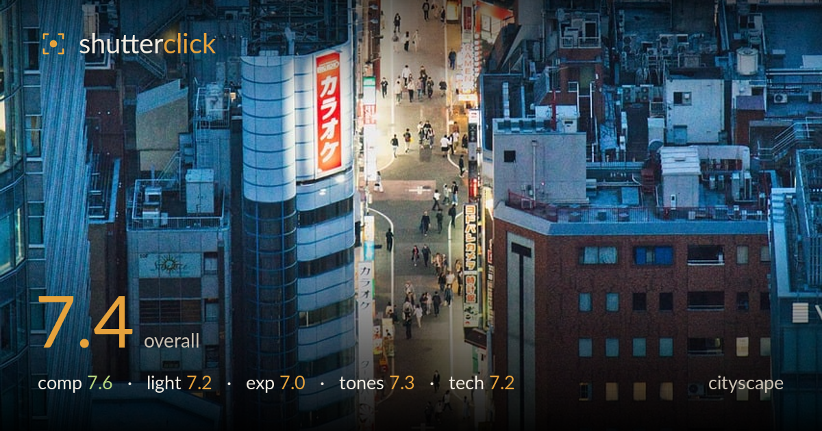
Blue hour over a tokyo street
Photo by r-q

No EXIF metadata in this file
Technical analysis based on visual assessment only.
A strong elevated telephoto compression that turns a Tokyo shopping street into a channel of activity funnelling the eye down its length. The pedestrian corridor is the backbone of the frame and it reads clearly, flanked by dense signage and rooftops that give a genuine sense of the city stacking on itself. What most holds it back is the blue-hour balance sitting slightly flat — the sky-lit portions and warm street glow don't quite resolve into a decisive mood — and a top edge that ends on a jumble of cool rooftops rather than a resolving anchor. The vertical crop and layering are the real assets here.
The vertical framing suits the subject, using the street as a central spine that draws the eye from foreground crossing to distant vanishing point. Telephoto compression stacks buildings convincingly and the karaoke tower on the left gives a strong repeating vertical anchor. The balance between the busy left and the brick block on the right works. The weakness is the top third, which dissolves into indistinct grey rooftops with no clear terminus for the eye — the street's energy peters out rather than resolving on a landmark or lit horizon.
Shot at blue hour, which is the right call for this kind of scene — ambient sky fills shadows while shop signs and street lamps carry the warmth. The mix reads best in the lower half where neon and interior glow pool along the pavement. Higher up the light flattens and the rooftops fall into a uniform cool cast that lacks modelling. Catching the moment ten to fifteen minutes earlier or later, with a deeper sky and more artificial light punching through, would give the frame more tonal drama.
Exposure is well controlled for a high-dynamic-range dusk scene. The bright signage holds colour without blowing out, and shadow detail survives in the alley recesses and rooftop clutter. Midtones sit a touch flat and the overall brightness leans slightly dark, which mutes the street glow. The histogram appears to use its range without hard clipping, a genuine achievement given the point-source lights. A modest lift to the shadows and a touch more separation in the midtones would let the lit corridor read with more punch.
The cool-warm interplay of blue-hour sky against sodium and neon is the tonal story, and it's present but understated. Whites on the signage stay clean and the reds hold saturation. Overall the palette skews muddy in the rooftops, where greys and browns blur together without enough contrast to separate the layers. White balance sits neutral to cool, appropriate for the hour. A slight increase in contrast and vibrance would give the scene the electric quality this kind of density can deliver.
Focus is placed well down the street and depth of field appears sufficient to keep the layered buildings acceptably sharp front to back, consistent with a longer focal length stopped down enough to hold the scene. There's no obvious motion blur in the pedestrians, suggesting a shutter fast enough for the ambient level, and noise is well managed for a dusk exposure — shadow areas stay reasonably clean without heavy smearing. Detail in the signage and window grids holds up, which points to careful capture and a steady platform, likely a tripod or firm rest given the reach. The main limitation is a slight overall softness in the far distance, partly atmospheric haze and partly the resolution limit of the compression rather than a focus miss. The framing choice of a telephoto from an elevated position is well judged for this subject; the execution supports it. Nothing here undermines the image — the technical foundation is sound and gives room to push the grade harder.
What would elevate it
Tags
Shot something like this?
Expert photo critique, on demand — scored across six categories, EXIF-aware. Start with 3 free critiques, no credit card.
critique my photo — free