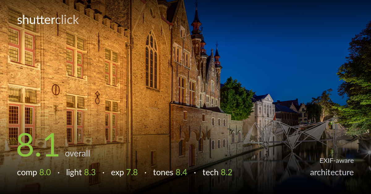
Blue hour reflections on the canal
Photo by Dietmar Rabich

| Focal length | 24 mm |
| Aperture | f / 10.0 |
| Shutter | 13.0 s |
| ISO | ISO 100 |
A confident blue-hour canal scene that pairs warm artificial light on the gabled facades against a deep, clean cobalt sky — the timing is the strongest decision here, balancing the two light sources beautifully. The receding wall on the left creates strong depth and the still water delivers clean reflections. What holds it back is the slightly empty central-right region around the modern bridge sculpture, which reads as visually weaker than the rich left side, and a horizon that could be steadier. The warm/cool contrast and the controlled exposure across a tough dynamic range carry the image.
The strong diagonal of the left facade pulls the eye into the frame with real depth, and the canal reflection anchors the lower half. Placing the buildings on the left with the sky and water opening to the right is a sound choice. The weakness is the right side: the modern bridge structure and distant buildings feel cluttered and less resolved than the dominant left wall, leaving a slight imbalance. The reflection occupies a generous lower third that mostly repeats the top without adding new information.
The blue-hour timing is the standout — the warm tungsten and sodium light on the brickwork sits against a saturated, even sky that hasn't gone black, which is exactly when this kind of scene works. The artificial illumination on the facades is directional enough to model the gables and window recesses without flattening them. The cooler, harsher LED light on the modern bridge clashes slightly in colour temperature, but that tension is part of the scene rather than a fault.
Exposure is well managed across a demanding range. The lit window interiors on the left hold just enough detail before clipping, and the deep shadow areas in the lower facade and water retain structure rather than blocking up. The bright LED bridge lights are the main risk and they verge on blowing out, with a small clipped point near the right edge. The sky is exposed to keep its gradient intact. A slightly shorter exposure or shadow lift in post would balance the brightest highlights.
The colour relationship is the image's biggest asset: golden, amber facades against a deep blue sky and near-black water, a classic complementary blue-hour palette handled with restraint rather than oversaturation. White balance keeps the warm light convincingly warm without going orange. Tonal range is broad, from the bright windows to the dark canal, with smooth gradation in the sky. The reds in the window frames and tower roofs add accent without competing. Mid-tone contrast on the brick texture is well judged.
The technical choices suit the scene well. At 24mm on full frame the wide view captures the full canal sweep, and f/10 delivers front-to-back sharpness across the receding facade and reflection without pushing into diffraction softening. ISO 100 keeps noise negligible even in the dark water and sky, which is critical for clean blue-hour shadows. The 13-second exposure on a tripod renders the water glassy and the reflections crisp, exactly the right call. Focus appears accurate through the building plane. Minor points: a wide lens at 24mm introduces mild perspective distortion in the verticals, and the gables lean slightly — perspective correction or a touch of careful tilt would tidy the converging lines, which architecture work judges strictly. The brightest LED lights on the bridge are at the edge of clipping, and exposure blending or a graduated approach would have tamed them. Overall a technically clean, well-executed long exposure with sound depth-of-field and ISO decisions.
what would elevate it
tags
Shot something like this?
Expert photo critique, on demand — scored across six categories, EXIF-aware. Start with 3 free critiques, no credit card.
critique my photo — free