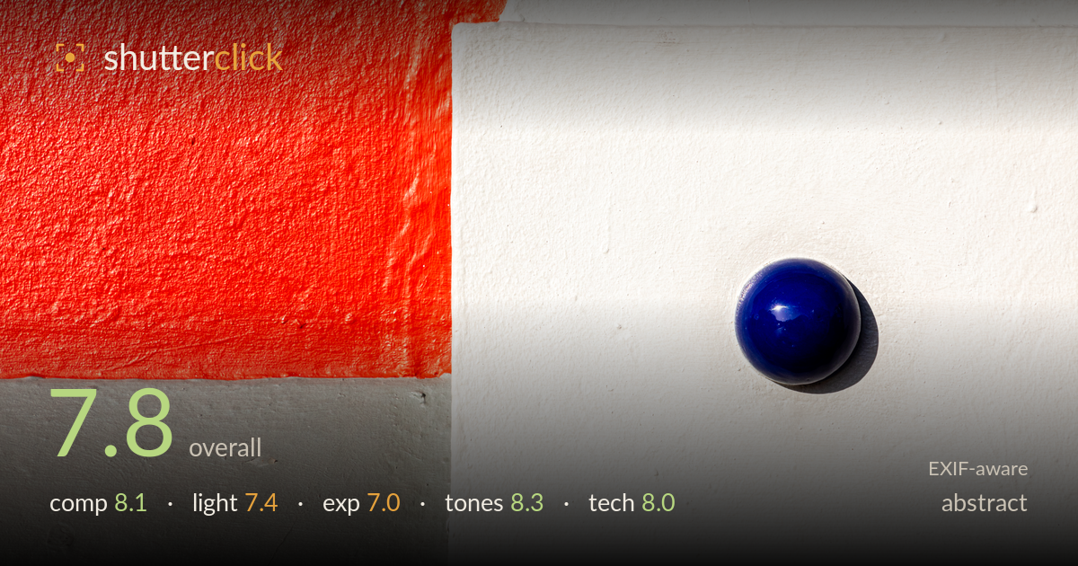
Blue sphere on painted wall
Photo by Dietmar Rabich

| Focal length | 105 mm |
| Aperture | f / 11.0 |
| Shutter | 1/500 s |
| ISO | ISO 400 |
| Exp. comp. | 0.0 EV |
| Shot at | 15:44 · Feb 29, 2024 |
A confident colour-block abstract built on a bold red-white-grey division, punctuated by a single glossy blue sphere that anchors the eye and earns its keep. The geometry is deliberate: the arc of red against the crisp white block gives the frame tension, and the sphere's placement in the lower-right white field balances the mass of colour on the left. What most holds it back is the white block, which runs a touch hot and loses subtle surface texture in the brightest areas. The composition flirts with too-even quadrant splits, but the sphere and the curved edge rescue it from being merely diagrammatic.
The frame divides into strong geometric blocks — the red arc, the white plane, the grey base — with the blue sphere acting as the single accent that resolves the whole arrangement. Its placement in the right-hand white field balances the heavier red mass to the left, and the diagonal cast shadow adds direction. The vertical seam between white and red sits near centre, which risks splitting the frame evenly; nudging that division off a cleaner third would sharpen the tension. Strong graphic intent throughout.
Hard, directional sunlight rakes across the surfaces, which suits the subject — it reveals the plaster texture on the red and grey walls and throws a crisp shadow beneath the sphere that gives it dimension and weight. The same hardness, however, blows the white block toward pure paper in its brightest zones, flattening the very texture it renders so well on the coloured surfaces. Slightly softer or lower-angled light would hold detail across the white while keeping the shadow definition on the sphere.
Exposure is pitched to protect the saturated red and the blue sphere, both of which hold rich detail. The cost is the white block, where the brightest passages clip toward featureless white and lose the subtle stucco grain visible elsewhere. Pulling exposure down a third of a stop, or recovering highlights in post, would restore that texture without muddying the colours. The grey base and shadow retain good detail, so dynamic range is nearly there — just the highlights need reining in.
The colour relationship is the picture's strongest asset: vivid orange-red, clean neutral grey, and a deep cobalt sphere sitting against near-white make a punchy, well-balanced triad. White balance reads accurate and the reds stay saturated without bleeding into orange mush. The blue holds its depth and the specular highlight on the sphere keeps it from going flat. Contrast between the matte walls and the glossy sphere adds welcome material variety. Only the white's tonal roll-off at the top end wants restraint.
The settings are well matched to the subject. At f/11 on the 24-105 at 105mm, depth of field is ample for a near-flat wall, and everything from the plaster texture to the sphere's surface reads sharp and cleanly resolved. ISO 400 is a mild choice for bright sun and keeps noise invisible across the smooth white and grey fields, where shadow noise would otherwise show first. 1/500s is far faster than a static wall requires — a lower shutter and ISO 100 would have been the cleaner pairing — but no harm results and it guards against camera shake at this focal length handheld. Focus lands accurately on the sphere and the wall plane, with the specular highlight and cast shadow rendered without softness. The lens performs well stopped down, showing good edge-to-edge sharpness and no obvious fringing along the high-contrast red-white boundary. Solid, deliberate execution; the only refinement is trimming shutter and ISO for maximum tonal cleanliness in the highlights.
What would elevate it
Tags
Shot something like this?
Expert photo critique, on demand — scored across six categories, EXIF-aware. Start with 3 free critiques, no credit card.
critique my photo — free