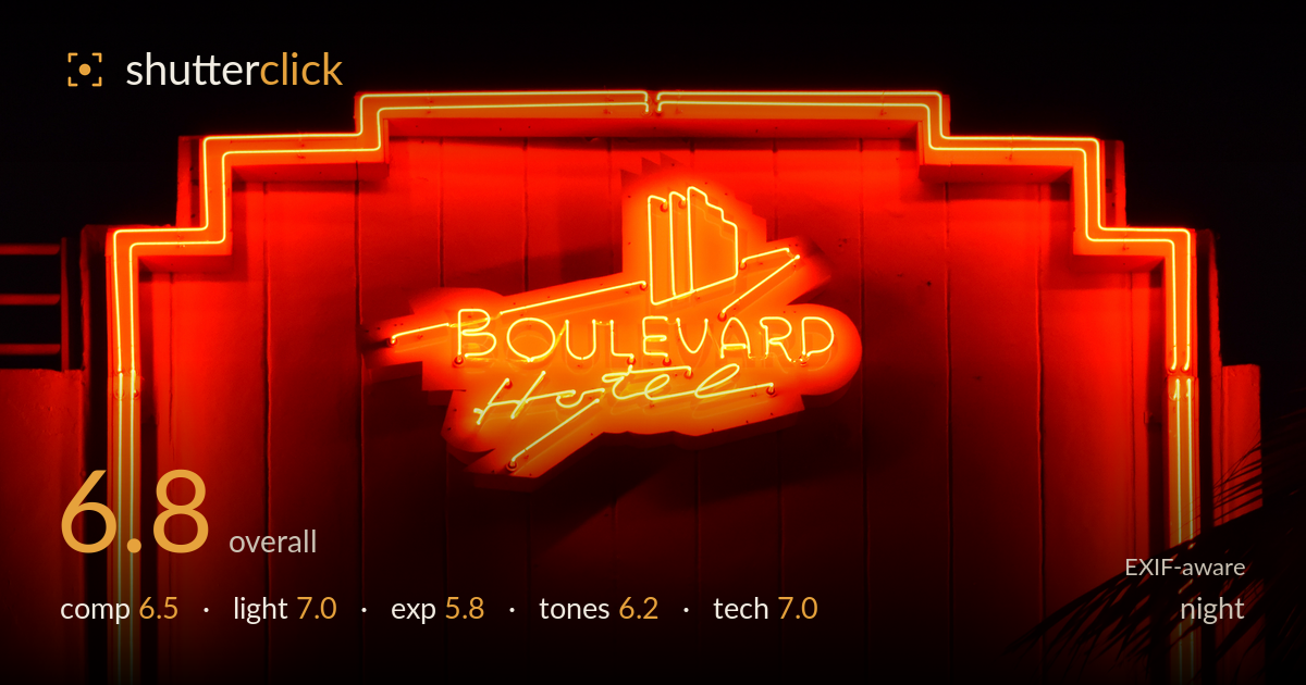
Boulevard hotel neon at night
Photo by Photograph: Radomianin

| Focal length | 55 mm |
| Aperture | f / 5.6 |
| Shutter | 1/60 s |
| ISO | ISO 900 |
| Exp. comp. | 0.0 EV |
| Shot at | 22:46 · Aug 25, 2018 |
The Art Deco neon sign is a strong subject, and the stepped geometry of the facade framing is captured cleanly against black night sky. What most holds the shot back is the blown-out neon: the brightest tubing and the lettering core clip hard, so the glass detail and the 'Boulevard Hotel' script lose legibility in the glare. The near-monochrome red palette suits the mood but flattens tonal separation, and the palm frond in the lower right is a distracting half-thought. Reining in the highlights and tidying the frame edges would let this handsome sign read with more precision and depth.
The stepped Deco frame of the neon border is used well, echoing the sign's own geometry and holding the composition together. Placing the logo slightly high and centred works for the symmetry of the architecture. The dark doorway at the bottom edge adds a base but is cropped awkwardly. The palm frond intruding lower right competes for attention without contributing — either committing to it as a framing element or excluding it entirely would strengthen the edge. Overall a solid, architecturally aware arrangement.
The light is entirely the neon itself, which is the right call for the subject — the tubing carries the whole image and spills warm illumination across the ribbed facade, giving a sense of glow and dimension. The falloff into shadow at the frame edges reads convincingly. The limitation is that the source is so intense it overwhelms its own detail; the brightest sections lose the delicate line quality that makes neon photogenic. A moment when the tubes are marginally dimmer, or a stopped-down exposure, would preserve more character.
This is where the image suffers most. The neon core and the script lettering clip to pure white-orange, erasing the glass detail and making 'Hotel' hard to read. The black surround is clean with no muddiness, which is good, but the bright-highlight decision leans too generous for such a strong light source. Metering for the neon itself — or bracketing and blending — would have held the tube detail. At present the histogram shows a hard spike against the right wall on the reds. A stop less would transform the sign's legibility.
The near-total red-orange palette is atmospheric and true to the neon, but it collapses tonal separation — the facade, the tubing, and the glow all sit in the same narrow hue, so the image reads flat despite the drama. White balance is warm as expected under neon. The deep blacks give good contrast against the sign, yet the mid-tones lack gradation because everything saturates toward the same colour. A touch more variation, perhaps preserving cooler shadow tones on the wall, would add depth.
At 55mm, f/5.6, 1/60s and ISO 900, the settings are reasonable for a static night sign handheld, and focus lands accurately on the lettering with the tubes rendered sharp. ISO 900 on the D3300 keeps noise controlled in the shadow areas, which is well managed. The 1/60 shutter is adequate given the stationary subject and moderate focal length, though it leaves little safety margin for camera shake — no visible blur here, so it held. The real technical shortfall is exposure control rather than gear: at f/5.6 the neon overpowers the sensor, and stopping down to f/8 with a faster shutter, or dropping exposure compensation by a stop, would have preserved the highlight detail that's currently clipped. Depth of field is ample for a flat subject at this distance. Focus, sharpness, and noise are all handled competently; the settings simply needed to be biased toward protecting the brightest values.
What would elevate it
Tags
Shot something like this?
Expert photo critique, on demand — scored across six categories, EXIF-aware. Start with 3 free critiques, no credit card.
critique my photo — free