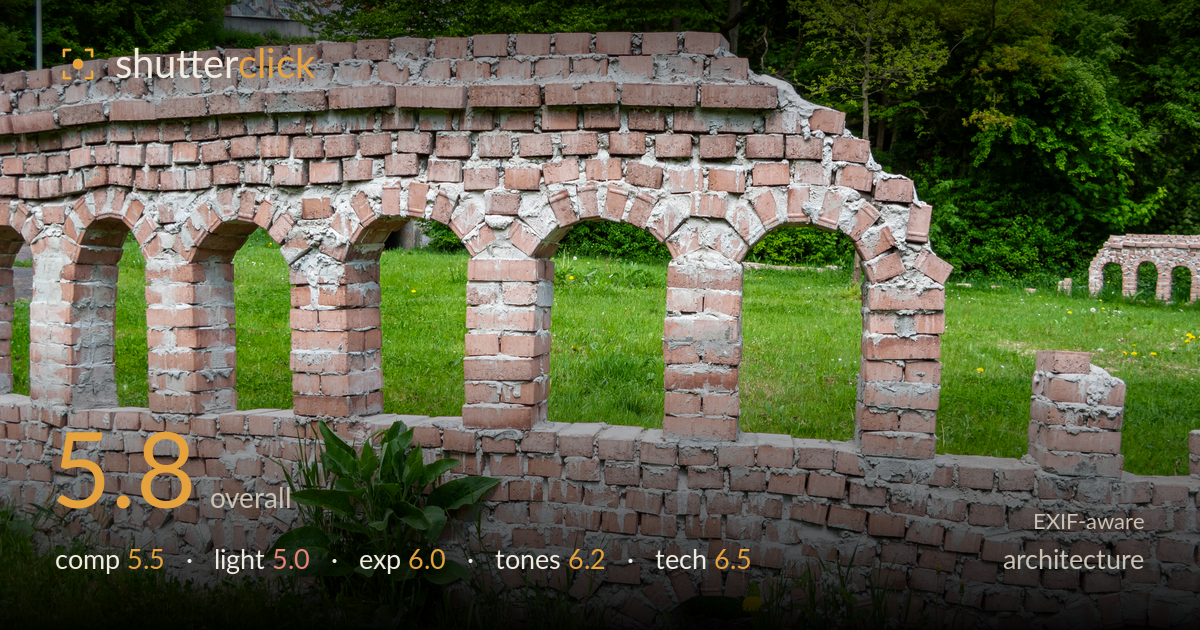
Brick arches in the grass
Photo by Dietmar Rabich

| Focal length | 7 mm |
| Aperture | f / 2.8 |
| Shutter | 1/60 s |
| ISO | ISO 80 |
| Exp. comp. | 0.0 EV |
| Shot at | 13:23 · May 10, 2013 |
A miniature brick arcade — likely a scale model or garden folly — photographed with clear documentation intent but little compositional shaping. The repeating arches are the strongest asset, offering natural rhythm, yet the wall runs nearly parallel to the frame and drifts out both edges, leaving the structure feeling cropped rather than framed. Flat midday light kills the depth these arches could have carried. The overgrown foreground plant and dandelions compete with the architecture without adding purpose. The subject is legible and the exposure holds, but the frame reads as a record shot rather than a considered image.
The arcade's repeating arches provide readymade rhythm, but the wall is shot flat-on and parallel to the frame, so the structure extends past both edges and loses its endpoints. There is no clear entry point or anchoring arch. The foreground weeds and dandelion clutter the base without contributing scale or narrative. A stronger oblique angle would let the arches recede and build depth, and a lower viewpoint would let one arch dominate as an anchor rather than presenting the whole run as an even, unweighted strip.
Overcast, near-frontal midday light flattens the brickwork. The arches, which depend on shadow within their openings to read as depth, appear muted and two-dimensional. Mortar and brick texture are visible but not sculpted — there is no raking light to reveal the surface relief. The dark green treeline behind separates the wall reasonably, but the light itself does no shaping work. Raking side light in early morning or late afternoon would carve shadow into each arch and give the masonry the dimensionality it currently lacks.
Exposure is broadly serviceable. The bright overcast sky in the upper left edges toward clipping but occupies little of the frame. Brick midtones sit well and retain detail across the mortar and stone. Shadows within the arch openings hold information without blocking up. The overall rendering is a touch flat, partly a product of the soft light rather than the exposure decision itself. A slight negative exposure compensation would have protected the sky highlights while keeping the brick tonality intact.
The warm terracotta and grey mortar sit pleasantly against the saturated spring greens, a natural complementary pairing. White balance is neutral and believable. Contrast is on the low side, again a reflection of the flat light, which leaves the brick reading slightly chalky. The greens are lively without oversaturation. A modest contrast and clarity lift in post would separate mortar from brick and give the masonry more presence. Overall the palette is honest and cohesive if lacking punch.
Shot at 7mm (roughly 33mm equivalent) on the small-sensor G9 at f/2.8, 1/60s, ISO 80. The wide aperture is a non-issue here because the deep effective depth of field of the compact sensor keeps the entire wall acceptably sharp, and focus lands well across the brickwork. ISO 80 keeps noise negligible and tonal transitions clean. 1/60s is fine for a static subject handheld at this focal length. The limitation is not the settings but the lens character and viewpoint: the wide, flat framing invites some perspective stretch at the edges, and the modest sensor limits micro-contrast in the masonry texture. Stopping down slightly to f/4–f/5.6 would have cost nothing in depth of field on this camera while landing closer to the lens's sharpness sweet spot. Verticals are largely upright, which suits the architecture genre, and no obvious keystoning intrudes. Execution is competent and clean; the constraints here are optical and compositional rather than errors.
What would elevate it
Tags
Shot something like this?
Expert photo critique, on demand — scored across six categories, EXIF-aware. Start with 3 free critiques, no credit card.
critique my photo — free