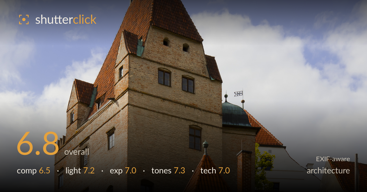
Brick castle in warm evening light
Photo by Diego Delso

| Focal length | 32 mm |
| Aperture | f / 13.0 |
| Shutter | 1/80 s |
| ISO | ISO 100 |
| Exp. comp. | 0.0 EV |
| Shot at | 16:56 · May 27, 2012 |
A handsome brick castle rendered in warm, low side light, but the low upward angle throws the verticals into strong convergence that reads as accidental rather than dramatic. The main tower leans inward and the whole structure narrows toward the top, which fights the sense of scale a castle should command. The warm-toned brickwork and the cloud-textured sky are genuine strengths, and the foreground greenery gives a base. The frame would gain most from perspective correction and a slightly cleaner separation between the layered structures on the right, which currently pile into visual clutter.
The vertical format suits the tower and the diagonal wall on the right creates a strong receding line into the frame. But the composition is unresolved: the steep upward tilt causes heavy keystoning, and the cluster of roofs on the right competes with the main tower for attention rather than supporting it. The foreground shrubbery fills the base but adds little structure. Placing the tower slightly off-centre and shooting from further back with more standoff would let the geometry breathe and reduce the sense of the building toppling backward.
Warm, low-angle sunlight rakes across the brick from the left, revealing texture in the masonry and giving the tiled roofs a rich glow — good timing toward the golden end of the day. Shadows on the right-hand walls give the forms depth without going murky. The sky retains soft cloud modelling rather than blowing out. The only limitation is that the tower's front face sits in a flatter, more frontal light than the raked side walls, so it reads slightly less dimensional than the rest.
Exposure is well controlled for a high-contrast scene. The bright cloudy sky holds detail without clipping, and the sunlit brick keeps highlight texture. Shadow areas in the trees and lower walls stay readable rather than blocking to black. Midtones sit comfortably, giving the brick its warmth without looking lifted. ISO 100 keeps everything clean. A touch more shadow recovery in the darkest foreground foliage would balance the frame, but nothing here reads as an accidental miss — the dynamic range is handled deliberately.
The palette is the image's strongest asset: warm terracotta roofs and honeyed brick set against a cool, softly clouded blue sky make a pleasing complementary contrast. White balance is accurate and the greens of the foliage stay natural rather than oversaturated. Contrast is judged well — punchy enough to give the masonry bite without crushing the shadows. The sky's gradation from blue to soft grey-white cloud is smooth. If anything the brick edges toward slightly heavy saturation in the sunniest patches, but it stays within believable limits.
At 32mm on the full-frame 5D Mark II, f/13 gives ample depth of field to keep the entire castle sharp front to back, and it delivers — detail holds from foreground shrubs to the distant tiled roofs. ISO 100 keeps noise absent and tonal transitions clean. Focus is accurate across the plane. The 1/80s shutter is fine for a static subject on what appears to be a steady hold. The main technical shortcoming is not in the settings but in camera positioning: the steep upward tilt produces pronounced converging verticals that a tilt-shift lens, a longer standoff with a longer focal length, or deliberate perspective correction in post would resolve. f/13 also risks mild diffraction softening on this sensor, though it isn't visibly limiting here — f/8 to f/9 would have preserved edge crispness with adequate depth. Overall a technically sound capture whose execution is let down chiefly by the geometry of the viewpoint.
What would elevate it
Tags
Shot something like this?
Expert photo critique, on demand — scored across six categories, EXIF-aware. Start with 3 free critiques, no credit card.
critique my photo — free