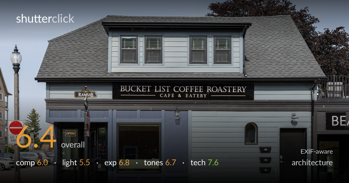
Bucket list coffee roastery storefront
Photo by Crisco 1492

| Focal length | 40 mm |
| Aperture | f / 8.0 |
| Shutter | 1/320 s |
| ISO | ISO 200 |
| Exp. comp. | 0.0 EV |
| Shot at | 20:59 · Jun 3, 2025 |
A clean, documentary record of a corner cafe that captures the building honestly but lacks a strong point of view. The frontal framing keeps verticals largely true, and the signage reads clearly, which serves a commercial purpose well. What holds it back most is the flat midday light — hard, high overhead, and offering little to model the facade's texture or the gambrel roof's form. The composition centres the building without a clear organizing decision, leaving the lamppost and signpost competing in the left third. Tighter framing and softer, lower-angle light would lift this from a useful record toward a more deliberate architectural portrait.
The facade is presented squarely, which keeps the signage legible and the verticals close to true — appropriate for a storefront record. But the framing is loose and slightly unresolved: the lamppost, stop sign, and street-name post pile up in the left third while the neighbouring 'BEA' shopfront intrudes on the right, weakening the subject's containment. The wide foreground of brick and asphalt eats space without adding interest. A choice between a clean full-facade or a tighter crop on the corner entrance would give the frame a clearer purpose.
The hard, near-overhead midday sun is the weakest element here. It flattens the blue-grey siding, leaves the deep eaves and recessed entrance in muted shadow, and gives the gambrel roof little dimensional modelling. The clear sky offers no diffusion, so the textures of shingle and lap siding read as tonal blocks rather than surfaces. Side light from a lower sun — early morning or late afternoon — would rake across the cladding, reveal the roof's pitch, and separate the facade planes that currently merge.
Exposure is well controlled for a bright, high-contrast scene. The blue-grey siding holds midtone detail, the dark signboard and trim retain texture rather than blocking up, and the sky is rendered without obvious clipping. Shadow areas under the eaves and in the entrance stay readable. The histogram appears to use the available range sensibly with no exposure compensation needed. If anything, the brightest sidewalk highlights edge toward the top, but nothing critical is lost. A deliberate, accurate exposure throughout.
White balance is neutral and believable, with the blue-grey palette of the building reading true against a clean sky. Contrast is on the higher side from the harsh light, which suits the dark signage but slightly hardens the overall feel. Saturation is restrained and natural. The tonal range is broad but the midtones in the siding could carry more gradation — they sit a touch flat. The sky's gradient from deep upper blue to pale horizon is handled cleanly without banding.
Settings are well matched to the task. At f/8 on a 40mm focal length, depth of field is ample to hold the entire facade sharp front to back, and the image confirms it — signage lettering, window blinds, and the utility meter all render crisply. ISO 200 keeps noise invisible and preserves clean shadow detail under the eaves. 1/320s is far more than needed for a static building but does no harm. The RF24-105 at 40mm gives a near-normal perspective that minimizes distortion, and verticals are commendably close to true, suggesting careful camera levelling or modest correction. Focus is accurately placed across the plane of the facade. The only refinement worth noting: a slightly longer focal length from further back would have compressed the perspective marginally and helped exclude the neighbouring shopfront. Execution is sound throughout — this is a technically reliable capture with no errors of focus, motion, or noise to flag.
what would elevate it
tags
Shot something like this?
Expert photo critique, on demand — scored across six categories, EXIF-aware. Start with 3 free critiques, no credit card.
critique my photo — free