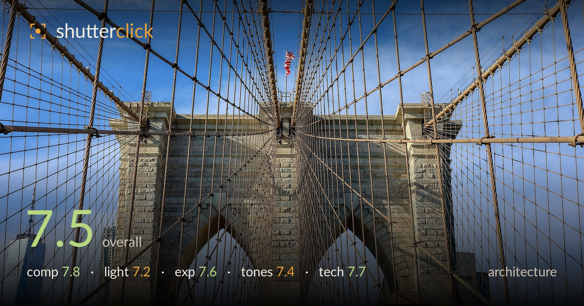
Cables converging on the bridge tower
Photo by Jmtd

No EXIF metadata in this file
Technical analysis based on visual assessment only.
A confident, near-symmetrical treatment of the Brooklyn Bridge tower that uses the radiating suspension cables as a natural web drawing the eye to the gothic arches. The cable geometry is the strongest asset, converging cleanly toward the centre. What holds it back most is the not-quite symmetry — the tower sits marginally right of centre and the vertical isn't perfectly plumb, which matters in a shot leaning this hard on formal balance. One World Trade Center at the left edge adds welcome context but is nearly clipped. Precise squaring-up and a slightly tighter, deliberate crop would sharpen the whole thing considerably.
The converging cables form a striking radial web, and centring the tower plays that symmetry hard, which suits the subject. The twin arches anchor the lower frame with satisfying weight. But the symmetry is approximate rather than exact — the tower reads slightly right of centre and the two cable fans aren't evenly balanced, undercutting the formal intent. The One World Trade spire at the far left is nearly cropped out; either fully committing to it or excluding it would read cleaner than the current near-miss.
Side light rakes across the stonework, picking out the granite texture and giving the tower dimension rather than flattening it. The arches hold good modelling in their recesses. Timing is a touch harsh — the high, hard sun creates strong contrast that clips some cable highlights and deepens shadow pockets in the masonry. Softer, lower-angle light from later in the afternoon would have wrapped the tower more gently and eased the tonal jump between the sunlit and shaded faces of the stone.
Exposure is well judged for a high-contrast midday scene. The sky retains blue and gradation without blowing out, and the stonework holds detail across its lit and shaded faces. Shadow areas in the arch recesses keep information rather than blocking up. A few of the brightest cable strands touch clipping where they catch direct sun, but this is minor and hard to avoid at this contrast. The midtones on the granite sit at a natural brightness that reads convincingly.
Colour is clean and believable — the warm sandy granite plays nicely against the cool blue sky, a pleasing complementary pairing. White balance looks neutral and the flag's red reads true. There's a mild HDR-flavoured flatness in the contrast rendering, with the sky feeling slightly over-processed toward the corners where saturation dips. Pulling back a touch of the local-contrast processing and letting the tonal range breathe more naturally would give the stone more honest depth without the faintly synthetic edge.
Sharpness is strong across the frame, from the near cables to the distant skyline, indicating a well-chosen aperture and a lens with the reach to compress the tower against the arches. Focus lands accurately on the stonework and the cable detail is crisp enough to count individual strands. Depth of field is deep and appropriate for architecture, keeping foreground rigging and background towers both rendered. No visible motion blur or noise to speak of, suggesting a comfortable shutter and low ISO under the bright conditions. The main technical shortfall is not capture but geometry: the verticals aren't perfectly plumb and the framing isn't quite square to the tower, which a symmetric composition of this kind demands. A slight perspective correction in post, or more careful levelling at capture, would resolve it. The faintly aggressive local-contrast processing also nudges the file toward an artificial look that clean single-exposure handling would avoid.
What would elevate it
Tags
Shot something like this?
Expert photo critique, on demand — scored across six categories, EXIF-aware. Start with 3 free critiques, no credit card.
critique my photo — free