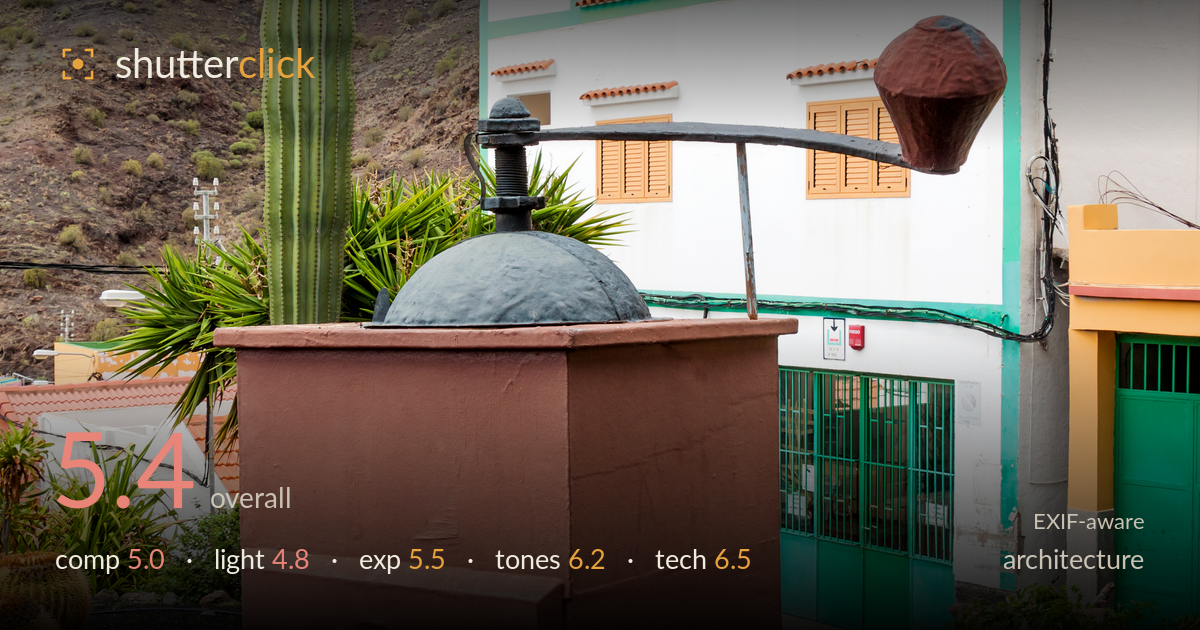
Cactus garden below the mountain
Photo by H. Zell

| Focal length | 22 mm |
| Aperture | f / 9.0 |
| Shutter | 1/60 s |
| ISO | ISO 100 |
| Exp. comp. | 0.0 EV |
| Shot at | 17:40 · Nov 7, 2016 |
This reads more as a documentary record of a village cactus garden than a considered architectural study, and that split focus is what holds it back. The white-and-green building competes with an old olive press, a giant cactus, and a foreground of barrel cacti, so no single element commands the frame. The mountain backdrop adds context but crowds the top edge. There is genuine visual interest here — the colour play between the green trim, orange shutters and terracotta press is lively — but the frame needs a clearer decision about what the subject actually is, and the light is flat and midday-diffuse.
The frame tries to hold too much at once: the olive press dominates the middle, the building sits behind it partly obscured, and barrel cacti fill the base. As architecture, the building is neither cleanly isolated nor fully shown — the press blocks its lower half and the crop lops the roofline against the mountain. The tall cactus provides a strong vertical anchor on the left third, which works. A decision to feature either the building facade or the press as the primary subject would resolve the current tug-of-war.
Overcast, diffuse midday light flattens the scene. The mountain loses its rock texture and modeling, the building facade sits without shadow definition, and the blown highlight top-left where the sun burns through the cloud pulls the eye off-subject. Soft light does keep the cactus spines and terracotta tones evenly rendered without harsh contrast, which suits detail. But architecture generally benefits from raking light to reveal form and depth in the facade, and none of that shaping is present here.
Exposure is broadly serviceable but compromised by the sky. The upper-left corner is fully clipped where sun breaks through cloud, an unrecoverable patch that draws attention. The building whites hold just enough detail, and the dark volcanic gravel in the foreground retains texture rather than blocking up. Midtones on the mountain and press sit reasonably. A slight negative exposure compensation or a graduated approach would have protected that bright sky without sacrificing the shadowed foreground much.
Colour is the strongest aspect. The interplay of emerald window bars and trim, warm orange shutters and building base, and the terracotta press gives the frame real chromatic energy. White balance is neutral and believable under overcast light. The barrel cacti carry pleasing reds and golds. Contrast is naturally low from the flat lighting, which leaves the image slightly muted; a modest contrast and clarity lift would give the greens and terracotta more separation and snap.
The settings are sensible for the conditions. At f/9 and 22mm the depth of field is deep, keeping foreground cacti, press and building acceptably sharp front to back — the right call for this kind of layered scene. ISO 100 keeps the image clean with no visible noise, and 1/60s is adequate for a static subject handheld with the lens's IS, though it leaves little margin. Focus sits appropriately in the mid-ground. The main technical weakness is genre-specific rather than a settings error: at 22mm the verticals show mild convergence, and the building's lines are not corrected — the walls lean subtly inward. For architecture, a perspective correction in post or a more square-on shooting position would fix this. The lens is a reasonable general-purpose choice, but the wide focal length forced the inclusion of competing elements. Execution is competent; the limitation is in framing intent, not in the camera handling.
What would elevate it
Tags
Shot something like this?
Expert photo critique, on demand — scored across six categories, EXIF-aware. Start with 3 free critiques, no credit card.
critique my photo — free