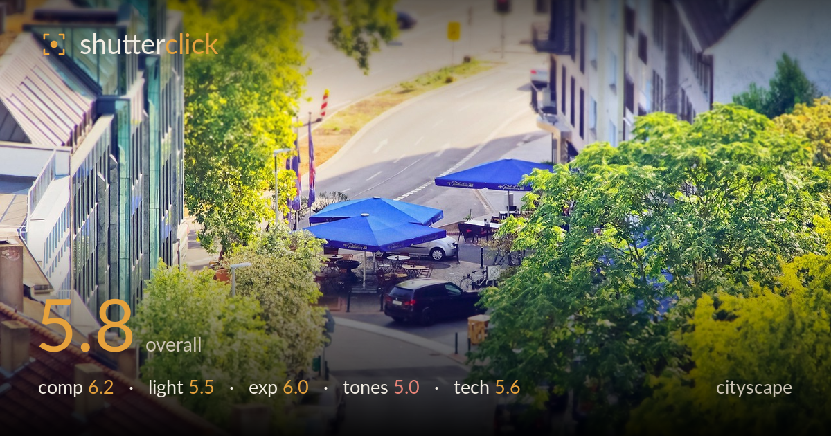
Café umbrellas on a leafy corner
Photo by 652234

No EXIF metadata in this file
Technical analysis based on visual assessment only.
The elevated vantage looking down a leafy street corner has real potential, and the two blue café umbrellas give the frame a strong, saturated anchor point among all the green. What most holds the shot back is the heavy tilt-shift-style blur applied top and bottom, which reads as a digital effect rather than an optical one and softens too much of the frame, and an oversaturated, slightly warm-yellow colour grade that pushes the foliage toward acid green. Cleaner processing and a more restrained selective focus would let the genuinely nice miniature-city feel come through without looking gimmicky.
The high overhead angle and the converging street create a natural funnel that draws the eye down to the blue umbrellas, which sit near a strong intersection of thirds. The framing trees on both sides work as organic vignettes. However, the composition is cluttered at the edges and the bottom foreground of parked cars adds little, while the top of the frame drifts into indistinct road and buildings. A slightly tighter crop concentrating on the café plaza would sharpen the story.
The light is flat, high midday sun with little directional modelling, which leaves the scene looking uniform and lacking depth. Shadows are short and unremarkable, and the foliage is lit evenly rather than raked to reveal texture. The blue umbrellas hold their colour well, but nothing in the scene is shaped by the light. A lower sun angle in early morning or late afternoon would introduce longer shadows and warmer, more dimensional light across the street canyon.
Exposure is broadly sound, with the umbrellas and mid-tones well placed and no severe clipping in the shadows under the trees. The brightest road surfaces and pale building faces at the top edge run a touch hot but retain detail. Overall the dynamic range is handled acceptably for a bright daylight scene. The image sits slightly bright globally, which combined with the warm grade lifts the whole frame; a modest pull-down of the highlights would restore a little punch.
This is the weakest area. The colour grade is pushed hard toward warm yellow-green, giving the foliage an artificial, acid cast and the whole frame a slightly jaundiced overall tone. Saturation is heavy across the greens and the blues, so the scene reads processed rather than natural. White balance leans warm. Dialling saturation back, cooling the white balance a step, and separating the yellows from the greens would produce far more believable, appealing city foliage.
The obvious technical choice here is a tilt-shift or faux-miniature treatment, with sharp focus retained through a horizontal band across the café umbrellas and cars, and heavy blur applied to the top and bottom of the frame. The problem is that the blur reads as a post-processing gradient rather than genuine optical falloff — it does not follow the true focal plane, so foreground rooftops and distant road are smeared in a way that looks digital rather than photographic. Where focus is retained, the detail is adequate but not crisp, suggesting the base capture was slightly soft or the effect has eroded fine detail. Noise is well controlled in this bright light. The core capture is competent for a grab from an elevated window or balcony, but the miniature effect is overdone and applied without regard to the actual geometry of the scene. A subtler, more selectively placed blur — or none at all with a genuinely sharp full-frame capture — would serve the subject better.
What would elevate it
Tags
Shot something like this?
Expert photo critique, on demand — scored across six categories, EXIF-aware. Start with 3 free critiques, no credit card.
critique my photo — free