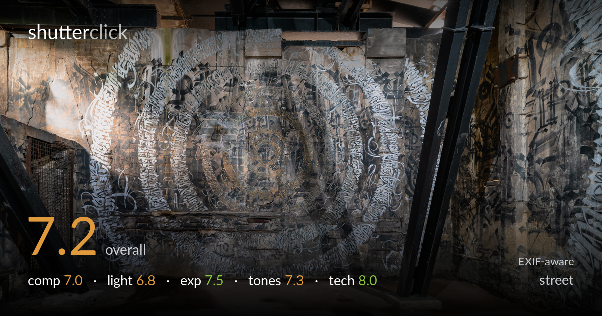
Calligraphy wall in an abandoned interior
Photo by Flocci Nivis

| Focal length | 20 mm |
| Aperture | f / 9.0 |
| Shutter | 3.0 s |
| ISO | ISO 100 |
| Exp. comp. | -0.33 EV |
| Shot at | 14:09 · Oct 21, 2020 |
A richly textured study of a calligraphy-covered wall in an abandoned industrial space — the dense, swirling script is the clear draw and the wide framing lets it breathe within the room's structure. The black steel columns and exposed beams add useful framing and depth, but the large expanse of empty foreground floor consumes a third of the frame without adding much, weakening the balance. The mural's central spiral mandala is the natural anchor and reads well. Tightening the composition to favour the wall and trimming the dead floor would sharpen the impact considerably.
The wide-angle framing captures the full sweep of the calligraphy wall and uses the angled steel columns as natural framing elements, which adds depth and structure. The central spiral motif anchors the eye effectively. However, the foreground floor occupies roughly the lower third with little interest beyond a soft directional shadow, leaving the frame bottom-heavy. The right-hand column crowds the composition slightly. Raising the camera or stepping closer to reduce the empty floor would concentrate attention on the textured wall where the real subject lives.
The available light is soft and ambient, with a notable shaft entering from upper right that adds a welcome accent and some modelling to the beams. The illumination across the mural is fairly even and flat, which reveals the calligraphy detail but does little to sculpt the wall's relief or create drama. The brightest patch on the left wall pulls attention away from the central mural. Raking side light would have brought out the surface texture and layered script far more dramatically.
Exposure is well controlled across a tricky high-contrast interior. The deep shadows under the beams retain enough structure to read, while the brighter wall patches and the light shaft hold detail without blowing out. The slight -0.33 EV compensation helped protect the highlights from the window light. Midtones on the mural sit nicely, preserving the intricate script. The floor and darker corners stay legible. A balanced, deliberate exposure that makes good use of the dynamic range available in this dim space.
The muted palette of grey concrete, warm ochre staining and black steel suits the decayed, industrial mood. White balance leans slightly warm in the floor and upper beams, which feels appropriate to the setting. Contrast is moderate and lets the calligraphy's tonal layers separate without crushing. The gold and rust accents in the central mandala add subtle colour interest against the monochrome script. Saturation is restrained and honest. A touch more contrast in the mural could lift the script's legibility further.
At f/9 and 20mm on the D750, depth of field is comprehensive — front-to-back sharpness holds the wall texture, the steel framing and the floor in clean focus, which is exactly right for an environmental interior like this. ISO 100 keeps the file clean with no visible noise even in the shadow areas. The 3-second exposure was the correct call for this low ambient light and was clearly made on a tripod, since the static scene shows no motion blur and edges stay crisp. The 20mm focal length captures the room without excessive distortion, and verticals are reasonably controlled given the wide angle — the columns lean inward only slightly. Focus accuracy on the mural's central detail is precise. The settings are well matched to the subject and conditions throughout; this is technically assured work. The only minor consideration is that such a wide lens exaggerates the empty foreground, a compositional rather than technical cost.
What would elevate it
Tags
Shot something like this?
Expert photo critique, on demand — scored across six categories, EXIF-aware. Start with 3 free critiques, no credit card.
critique my photo — free